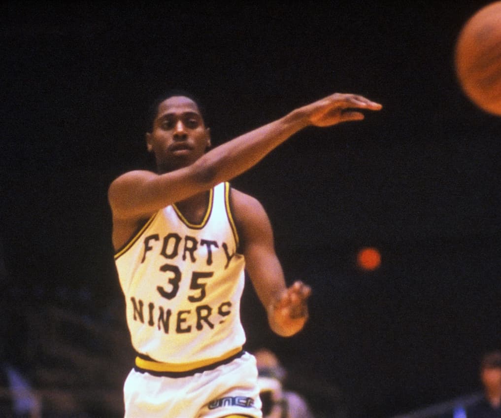
Love those gold unis but would prefer not to see a huge “UNC” on our chest. Lets do a fauxback jersey like that with either ‘NINERS’ or Forty Niners on the chest instead of ‘UNC charlotte’
Maybe this lettering similar to that Jon Davis pic:
Love those gold unis but would prefer not to see a huge “UNC” on our chest. Lets do a fauxback jersey like that with either ‘NINERS’ or Forty Niners on the chest instead of ‘UNC charlotte’
Maybe this lettering similar to that Jon Davis pic:
Yes. Emphatically yes.
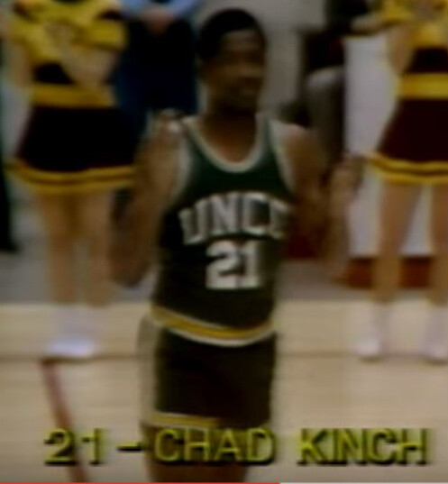
I’d love the UNCC final 4 throwback
Dubois clearly had “envy” of Belk Tower.
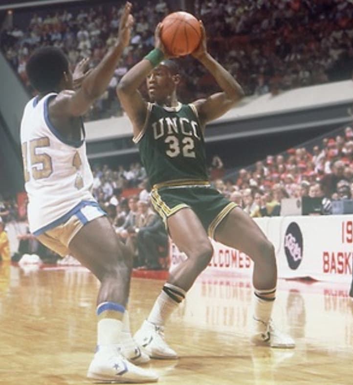
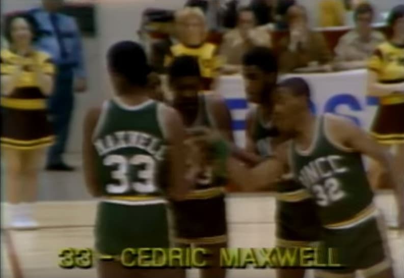
Gotta be the green 1977 unis. I don’t beleive we did anything for the 45th anniversary. 50th is coming up.
Thought this was relevant.
We should celebrate the 49th anniversary instead
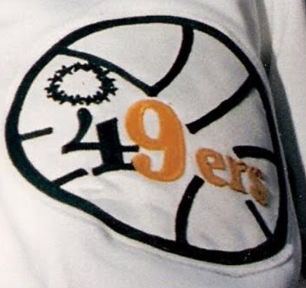
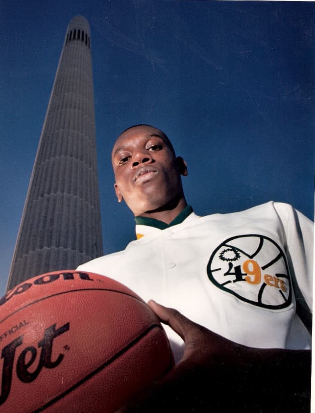
Always liked this logo. It was the original mid court logo in Halton.
clt says CLT is fine
I’ve hated every logo change since going away from the UNCC, but after a year or so I wind up liking them after all ![]()
This is a classic to me.
Yep. That’s why I chose it for my avatar. It’s from the tee shirts given out at our first game at Halton vs unc tweetsie.
Obviously:)
I was at first game too, but no t shirt. I was in upper deck. I think only lower deckers got those, and maybe students.
I was in upper deck. Got there early and think early birds got shirts until they ran out.
Im always an early bird too…no shirts for us.
Well lucky me.
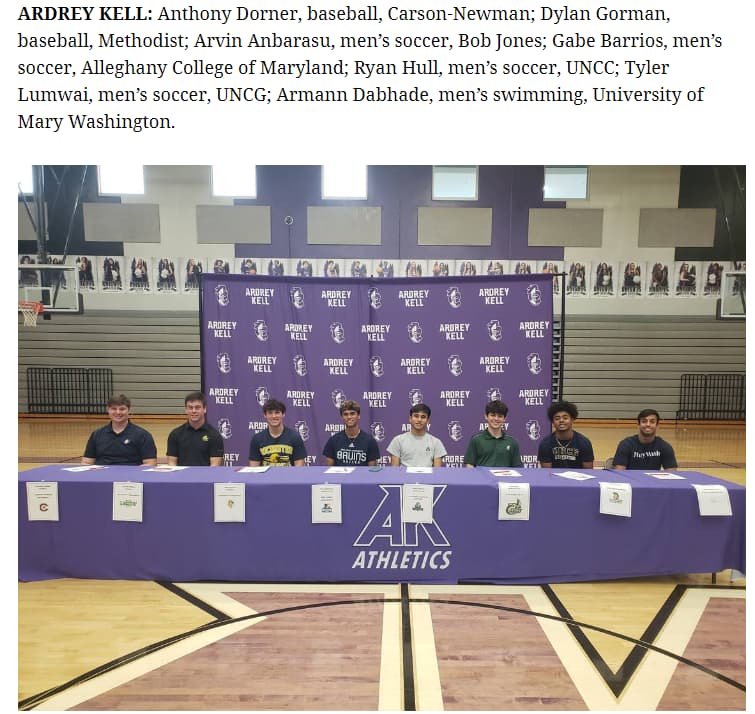
You would think that we would send out an official logo for signing day recruits to print… and/or the recruits and their school would actually know we have a new logo. Can be somewhat forgiven for out-of-state kids and schools - but local schools? Just shows how irrelevant our programs still are locally to the general sporting public.
I’m going to go out on a limb and say the Native American is for Indiana State.