I think Lambert was a little excited.
I think Lambert was a little excited.
I dig 'em. They look sharp.
lol, the second the bookstore leaked the uniform, I knew that would happen.
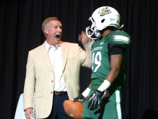
From a design perspective they look fine. They will look good on the field. I really like the all white one. I would have liked something more unique but given we are a program just getting started I am ok with these.
From a marketing point of view we missed a huge opportunity. Not having the cpick on the jersey is a big miss. From a branding point of view we really need that logo to be out and everywhere. Most of us wanted just the cpick on the helmet without the 49ers script, but the AD said it is not recognizable enough without the script, so on our jersey - what people will wear around - we didn’t put it at all. Brilliant.
Shade of green looks off in the pics - but waiting to see in person before going crazy about that.
[quote=“NinerWupAss, post:244, topic:27405”]From a design perspective they look fine. They will look good on the field. I really like the all white one. I would have liked something more unique but given we are a program just getting started I am ok with these.
From a marketing point of view we missed a huge opportunity. Not having the cpick on the jersey is a big miss. From a branding point of view we really need that logo to be out and everywhere. Most of us wanted just the cpick on the helmet without the 49ers script, but the AD said it is not recognizable enough without the script, so on our jersey - what people will wear around - we didn’t put it at all. Brilliant.
Shade of green looks off in the pics - but waiting to see in person before going crazy about that.[/quote]
I agree. These uniforms look much better with pads than the leaked image looked and I should have withheld my opinion until I saw the real thing. That being said, the uniforms could have been better, but I’m going into this with an open mind considering this is our first year. It will be hard for anyone to complain come August 31st. I do think for future designs, that we will need the c-pick or else us fans might grow restless.
The lack of a C-Pick is definitely baffling, but other than that, I really like them.
LOL, might be an opportunity for someone to sell “after market” iron/stitch-on C-pick logos…
Since we have to do so much of the marketing that the school should be doing this makes complete sense.
Like them except for the strip of duct tape right under /beside the arm pit. Guess it holds them together.
Definitely agree on C pick miss. Want that to be our signature moving forward.
They look great all the way around. No one needs to be picky about them at all. The stripe is fine and not too flashy. I like all the combinations as well. Eventually they will change when we get our feet wet for a while, but for now they are just fine for a start up program.
I was there last night, got to see the uniform on Clayton-Molby up close. I thought it looked really good, nice clean look. I am very happy!
Not to mention the gold on the background makes the gold missing on the uniform more noticeable IMO. When I look at the solid green unis, I don’t necessarily think Charlotte 49ers first thing.
As a whole, I do like them though. A clean look is smart.
Don’t overreact to any criticism/suggestions. We all like to play armchair quarterback. That’s one of the main reasons for having a message board.
Don’t overreact to any criticism/suggestions. We all like to play armchair quarterback. That’s one of the main reasons for having a message board.[/quote]
Yup! Over-reacting to things is why we have a football team. You can be critical and supportive at the same time.
The white jerseys are pretty sharp. I like our green, but as was mentioned we have one hell of a hard time matching our greens. Also, the green is dark and close to the black. The white jersey just has more pop to it. I’m also a man of practicality, the white will be easier to match if you buy one and you also won’t spontaneously combust on Aug. 31.
If I had to rank them I’d go:
1.) white jersey/green pants
2.) all white
3.) green jersey/white pants
4.) all green
Which pair of green pants do y’all like better?
Love 'em. Love our stadium. Love that we finally have football.
Noticed that “knee pads” (or pants) don’t cover the knees as they used to. May look “cool” or improve leg motion, but less knee protection seems risky. Cracked kneecap injuries will increase, I believe.[/quote]Someone commented to me today that our basketball shorts are longer than our football pants. ![]()
Love 'em. Love our stadium. Love that we finally have football.
Noticed that “knee pads” (or pants) don’t cover the knees as they used to. May look “cool” or improve leg motion, but less knee protection seems risky. Cracked kneecap injuries will increase, I believe.[/quote]Someone commented to me today that our basketball shorts are longer than our football pants. :D[/quote]
That someone is very observant, and now that you mention it, I think they may be correct.
Love 'em. Love our stadium. Love that we finally have football.
Noticed that “knee pads” (or pants) don’t cover the knees as they used to. May look “cool” or improve leg motion, but less knee protection seems risky. Cracked kneecap injuries will increase, I believe.[/quote]Someone commented to me today that our basketball shorts are longer than our football pants. :D[/quote]
That someone is very observant, and now that you mention it, I think they may be correct.[/quote]
They are. B-ball pants go to high or mid calf.
Love 'em. Love our stadium. Love that we finally have football.
Noticed that “knee pads” (or pants) don’t cover the knees as they used to. May look “cool” or improve leg motion, but less knee protection seems risky. Cracked kneecap injuries will increase, I believe.[/quote]Someone commented to me today that our basketball shorts are longer than our football pants. :D[/quote]
That someone is very observant, and now that you mention it, I think they may be correct.[/quote]
They are. B-ball pants go to high or mid calf.[/quote]
They will come down farther when we play
[quote=“CharSFNiners, post:254, topic:27405”]The white jerseys are pretty sharp. I like our green, but as was mentioned we have one hell of a hard time matching our greens. Also, the green is dark and close to the black. The white jersey just has more pop to it. I’m also a man of practicality, the white will be easier to match if you buy one and you also won’t spontaneously combust on Aug. 31.
If I had to rank them I’d go:
1.) white jersey/green pants
2.) all white
3.) green jersey/white pants
4.) all green[/quote]
My same rank. As far as the green being dark, have to wonder if the black accent under the arms would have popped more with a gold or white accent instead.