It looks really nice overall. Really appreciate all the work you guys do to put up and maintain this board, it’s clearly one of the nicest and easiest to navigate of college message boards.
I really enjoyed the tabs at the top of the page for the last version, but it’s not a big deal to lose them.
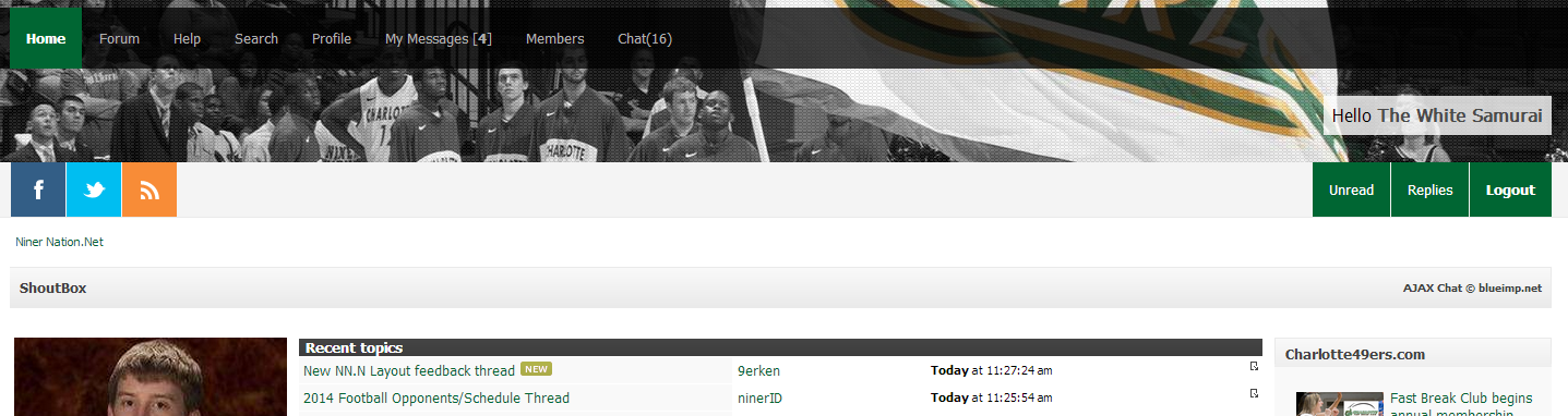
The threads are still a touch squeezed on my laptop, but they are readable to me. Anyway to widen the threads in settings, maybe allow the left column to be hidden?
Hmmm, not an issue for me but I’m used to wide screens, but I can see what you mean. I’ll expand the lower window in a bit and reduce the white space on the sides.
On width of forum area, I’ve decreased the whitespace on the sides in order to hopefully strike a compromise. Do a Ctrl-F5 to do a full refresh of the site.
I absolutely love the new layout. Looks crisp, modern, and is well organized, IMO. We continue to have one of the nicest message boards in college sports. Thanks Mac and mods.
Same here. Not a fan of the new layout, but I am a huge fan of Mac and his never ending efforts to keep this thing running smoothly.[/quote]
This. I think the sidebars would be okay if they added value, but I don’t think any of the content is anything I want to see, so they’re just wasted space.
Same here. Not a fan of the new layout, but I am a huge fan of Mac and his never ending efforts to keep this thing running smoothly.[/quote]
This. I think the sidebars would be okay if they added value, but I don’t think any of the content is anything I want to see, so they’re just wasted space.[/quote]
That’s my main issue. If we aren’t going to have anything useful or interesting in the sidebars, we should just get rid of them. They make it too cluttered.
Shrink the size of the header. It’s too big and pushes all of the info further down the page. The old one was the right size in my opinion.
Shrink or move the schedule feed and the Twitter feeds that are within the header. Too busy. If this is what has made the need for the header to be so big, then move it down the page below the threads or to the side.
Move the Facebook/Twitter/Feed buttons to the side so they don’t force the Shoutbox and the threads further down the page.
I like the solid green bar that has been added next to quated segments, but would also still like to see quoted segments either shaded or italicized.
I’m not opposed to change, but the former site was great.