I know people have mentioned Charlotte getting new logos at some point, with a consistent color pattern for apparel and such. Has anyone ever come across someone with their own concept of what a good 49er logo would be/look like? It would be fun to see what some talented graphic artist might do to improve the brand.
I suggest this to represent the last 15 years: 
1 Like
Perfect logo clayton!!!
I don’t know about you guys but we need to put the 704 guys on more stuff! These are some of the best branded Charlotte shirts I’ve ever seen and it was their first run at it.
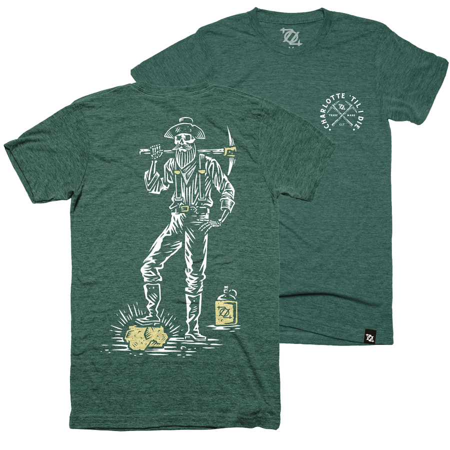
I won’t poop all over it but so far the 704 stuff I’ve seen doesn’t get me worked up.
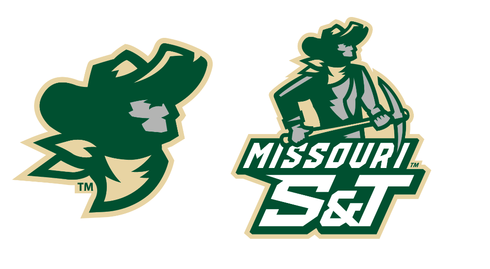
These are some pretty cool logos that involve a pick axe, and what I imagine a more modernized Norm would look like.
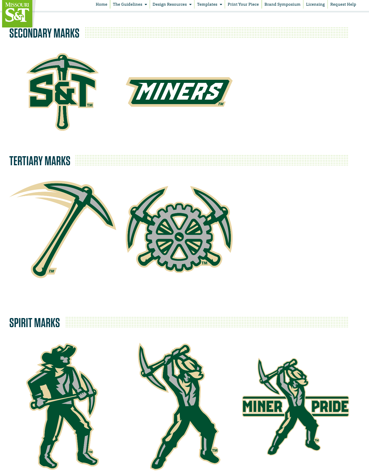
EDIT: Nice looking football helmets too!!
1 Like
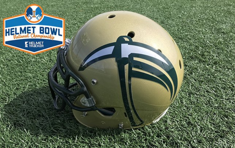
Helmet is simple, but sharp.
That’s pretty solid, but UTEP already staked their claim on the large vertical pickaxe helmet logo.
(Yes, pun intended)
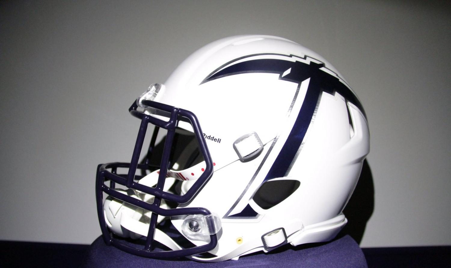
I gotta hand it to UTEP, though… they’ve got a damned sexy helmet.
I like the C-Pick concept but think it needs to be cleaned up and simplified.
I’ve often thought of turning the axe head on its side to form a C. Thoughts?
If we win ballgames I don’t care if we change our colors to pink and purple and have a unicorn on the side of our helmets
2 Likes
clt says go back to smokin norm and call it a day
Me neither.
I am thrilled that they are doing it, and that they sold out and have found it to be a good market, but I am with you guys, this is not my idea of great.
Aside from this shirt, I actually saw several people with 704 shirts on and also hats for the homecoming game. I’ve never really noticed so much before
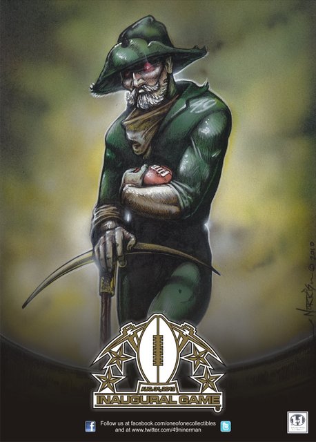
Looks like an old ABA hat !