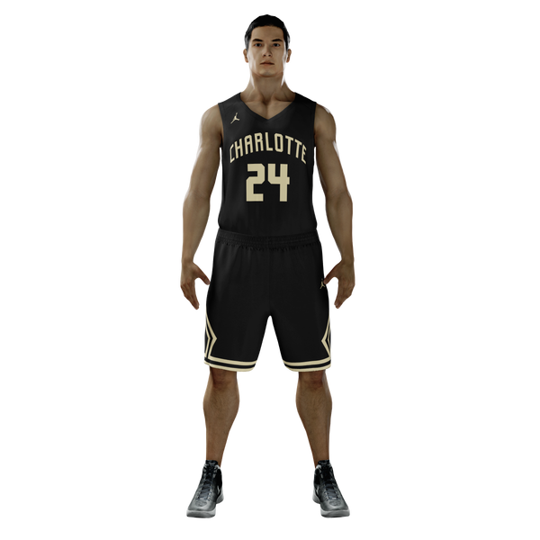
Got bored and ended up doing a rebrand concept for the basketball team’s uniforms.
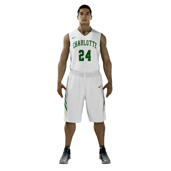
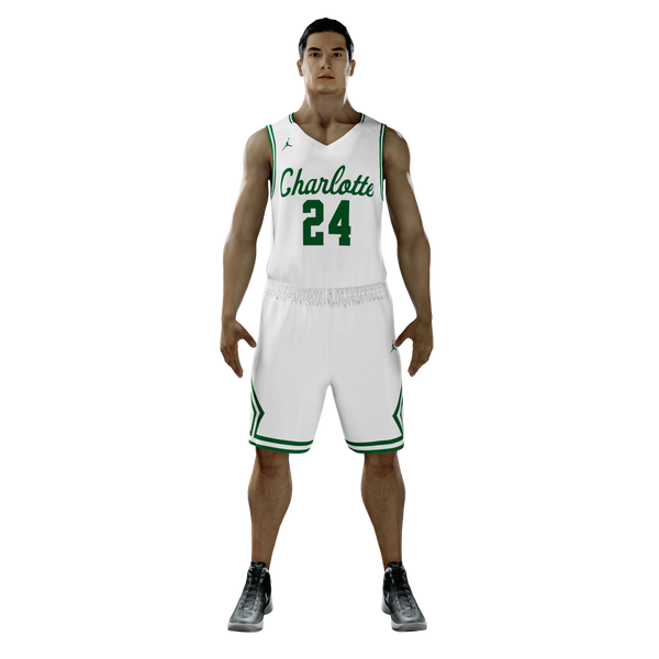
Home
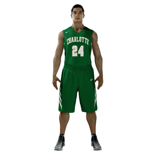
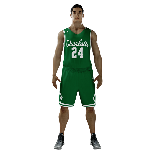
Away
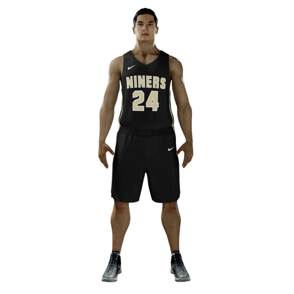
Gold Rush/Blackout Uniforms
Got bored and ended up doing a rebrand concept for the basketball team’s uniforms.
Home
Away
Gold Rush/Blackout Uniforms
Love it except the Jordan logo… I don’t want any more affiliation with the mothership
Just not a fan of the cursive…but the block lettering in the 3rd one on that uni looks nice!
clt say nope to the Jordan crap.
No jump man jordan crap
And do one in gold!
I stopped after I saw Jordan… 
It would appear the Jordan jersey is not held in high regard, I’ll make another one with the regular Nike cut 
The original was a quick concept so I’ll see what I can do with some time and effort
FWIW, Jordan Brand would help recruiting. I’d take it in a heartbeat.
Agree 2k. We have to do things the kids like.
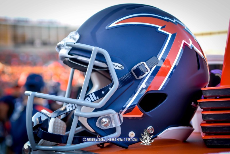
And our football team should 100% trash the 49er helmet wording and move to simple/highly marketable -pick. Some student a couple years ago designed 3-4 that were 100 fold better than helmets today. But its a comlex issue… :
1st thing i would do as AD is announce campaign on 1 green & 1 logo and encourage people to toss old gear/ buy new so we look unified and less rag tag.
[quote=“punchdrunk, post:11, topic:31234”]And our football team should 100% trash the 49er helmet wording and move to simple/highly marketable -pick. Some student a couple years ago designed 3-4 that were 100 fold better than helmets today. But its a comlex issue… :![]()
1st thing i would do as AD is announce campaign on 1 green & 1 logo and encourage people to toss old gear/ buy new so we look unified and less rag tag.[/quote]
I’ve never understood the reasoning behind the pick with 49ers being necessary so people can identify us or know who we are. Know one can identify us because of decades of inept marketing regardless of what we put on our helmet.
Plus…the helmet is just one part of the uniform. Charlotte and or 49ers can be on the jersey and pants…the uniform as a whole tells who we are…it just needs to be clean and sharp…not cluttered (like that logo looks on a helmet).
Conference mate UTEP doesn’t seem to be worried about that issue
VERY sharp!!!
Still would love to see a gold one :
[quote=“TRLeader, post:14, topic:31234”]VERY sharp!!!
Still would love to see a gold one ::)[/quote]
Gold is odd to work with, it either ends up looking like a really bad Purdue uniform or 1990s Pitt
[quote=“TRLeader, post:14, topic:31234”]VERY sharp!!!
Still would love to see a gold one ::)[/quote]
I like that look also. Gold would need to be with green lettering and numbers.
[quote=“FSL Owner, post:16, topic:31234”][quote=“TRLeader, post:14, topic:31234”]VERY sharp!!!
Still would love to see a gold one ::)[/quote]
I like that look also. Gold would need to be with green lettering and numbers.[/quote]
One of my faves
clt says looks great with the swoosh.
Jordan brand is a joke, crying meme is how the youths know him.
[quote=“punchdrunk, post:11, topic:31234”]And our football team should 100% trash the 49er helmet wording and move to simple/highly marketable -pick. Some student a couple years ago designed 3-4 that were 100 fold better than helmets today. But its a comlex issue… :
1st thing i would do as AD is announce campaign on 1 green & 1 logo and encourage people to toss old gear/ buy new so we look unified and less rag tag.[/quote]
I could go through a list a mile long of stuff that I’d do when it comes to branding and marketing and media and community outreach