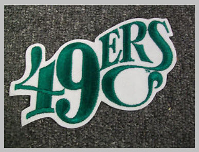
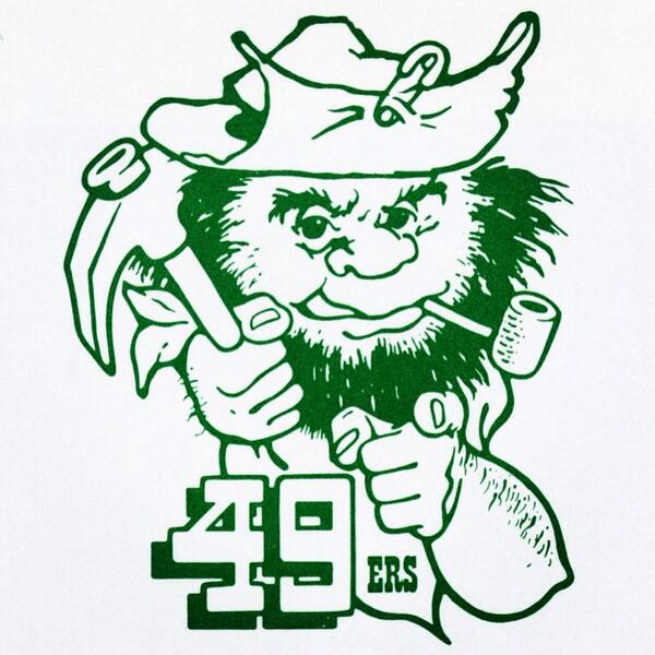
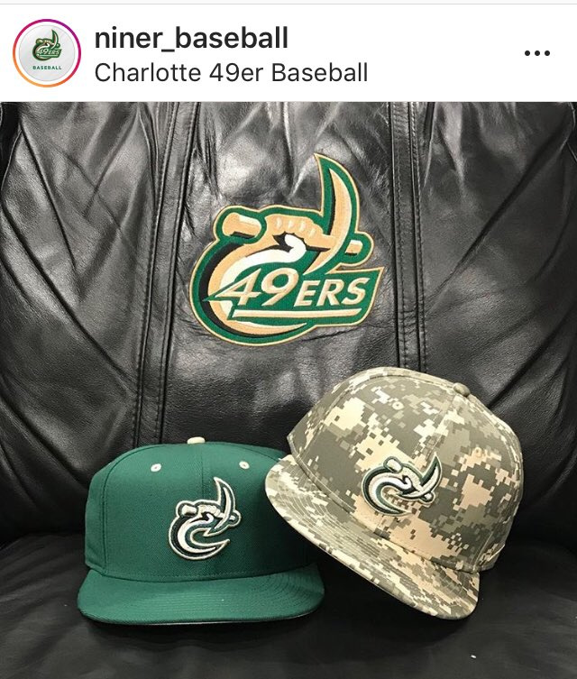
I really liked the new logos when they came out. It was a huge leap forward in terms of professional design than what we had. I don’t hate the logo (below) that proceeded our new one, but it could not be more generic. And the old Norm is nice in a vintage sort of way, but it looks like it was done with a crayon on a napkin. And it probably was. The “C” portion of our pick made sense to me as a fan because I read the press release, but I don’t think most people get it, therefore, it isn’t a good design. I would like to see us keep the basic design and make it better. I would also like our mascot to be a tough Norm.
It looks like the C-picks on the new helmets are much larger than the logo’s they wore in the spring game.
https://twitter.com/LibbyWeihsmann/status/1034484855701209088
Wish they had the gold face mask on them.
Of course gold facemask has C-49ers
I really don’t care what logo we use. Just win!
Just win!? How about…just stop embarrassing us??
I’ll take let’s just be mediocre!
I’d like for us to win with a big ass C-Pick logo on our helmets.
clt says no more metallic green on matte helmets
This was posted in the CUSA board: choose Conference USA on the left nav, then scroll down to the Charlotte Historical Helmets section.
Baseball is going back to the C-pick hats.
https://twitter.com/Diamond9erFans/status/1035119794901663744
The images on Instagram made those new helmets look good. The C-pick really stands out as a great helmet decal.
I would like to see that logo on Green or Black helmets - in those colors.
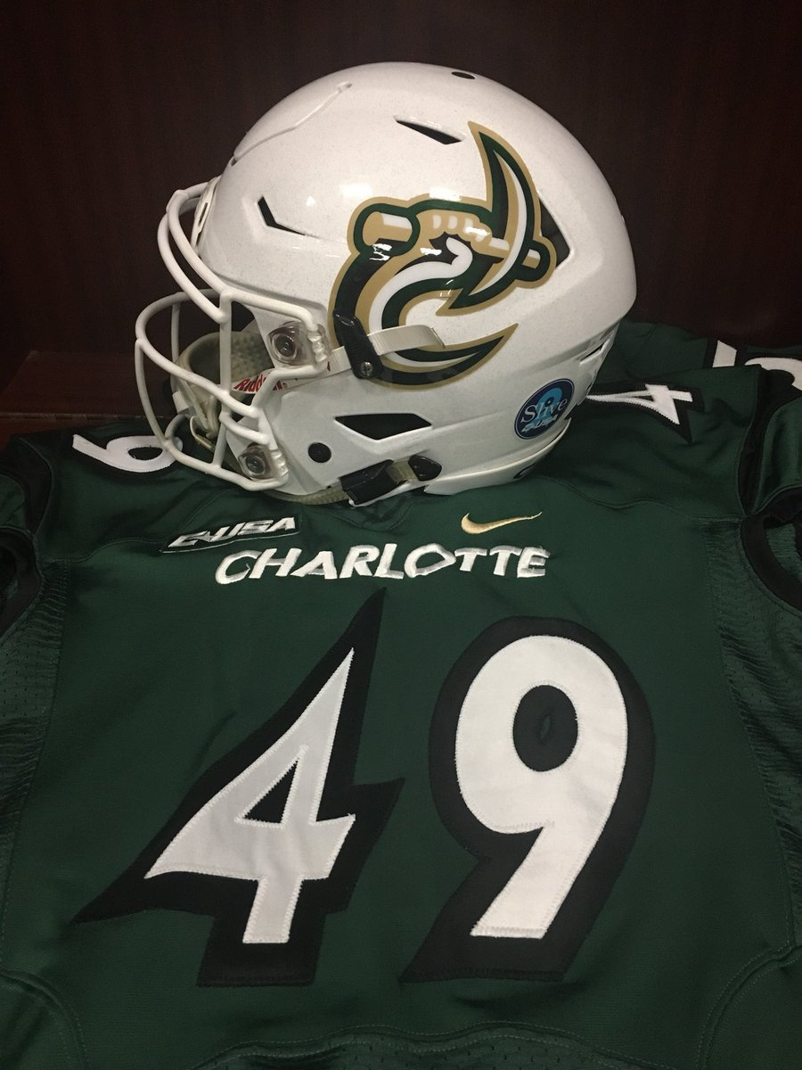
Didn’t know where to put this, but with the latest jersey reveal for this week, it looks like new unis are in order! Very nice. Like the new font for Charlotte, the numbers look like numbers again. Very clean and crisp. I want one!!
Mr. B, old post, but will the new hats be nike?
Yes, Nike hats.