We’ve had this poll before, but I don’t believe the poll results from the old NNN carried over to the new site.
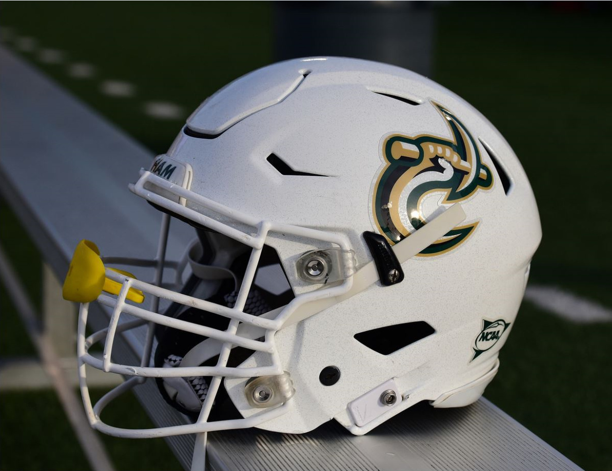
In response to the helmets used at the Green/White game, which logo helmet do you prefer?
- C-pick only
- C-pick and 49ers logo
0 voters
We’ve had this poll before, but I don’t believe the poll results from the old NNN carried over to the new site.
In response to the helmets used at the Green/White game, which logo helmet do you prefer?
0 voters
Whatever Edmunds designs is where my vote lands.
Gold facemasks every game
Definitely.
C-pick on one side and 49ers on the other.
clt says matte black helmet, gold facemasks and c pick.
Metallic green C pick YES
clt says metallic is fine, but match the green!!
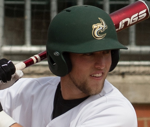
I’d like to see our matte green helmets with the gold facemasks, and the full color c-pick. Baseball had the matte green helmets for a year or so, and I thought that was a really good look with the C-pick.
clt agrees. that is fetch.
I can’t endorse this enough… That might be the perfect helmet based on our current options.
I was literally just thinking this morning…I wonder if Hill will ever have a student/alum/fan poll for our logo. C pick by itself or c pick with 49ers in it. Just under his leadership, i’ve seen a lot more of the solo C-pick. I’m thinking he may prefer that, but idk. Personally, I prefer the solo C-pick by itself, but from the helmet comparison above, it looks a little too big or something. Maybe the axe part is too big, not sure what didnt click with me initially. Then I started to wonder this (this would require a massive rebrand), but as our marketing improves and modernizes, what if we just used a more basic “C” like how Michigan, Maryland, Minnesota and so forth do with “M” (Different colors and font of course). I know it’s unrealistic, but just a thought that popped in my head of what if. Either way, I hope the AD starts leaning more towards the C-pick by itself on uniforms and apparel.
The thing about the logo on the helmets is it’s BLOB vs C when viewed from a distance, not a meter away.
Idk if y’all saw my tweet, but watching society figure out that “Oh that’s supposed to be a C” is awesome. Many kudos to those of you that have been pushing this for years.
clt hopes we go with some gold face masks with c pick
HAM ![]()
I agree with those that have said having the C-pick facing the way it does on the Tweet isn’t proper. I would like to see the 49er word mark or even the player’s number on that side (right).
C pick is better, but even it is not great. It needs modernizing, but the concept is in the right place.