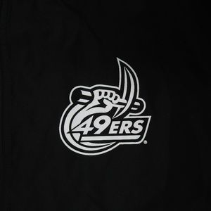
This is basically my take. If the CLT was on the side, I’m betting the reaction would have been more positive. Looks fine in that role.
My guess is we have only seen the silhouette. I expect more on Tues. Even the previous c-pick with one color is hideous and was still used on team apparel. I still expect primary helmet to be gold.

I’m just glad I don’t see a hand in our logo anymore. It was always too busy of a logo. Plus the number font used for 49 was weird. They looked even worse on jerseys. I said this before, there’s an old school, new school vibe with this new logo which I really like. Sounds like I’m in the minority, but the new logo is a big step up in my opinion. Can’t wait to see the rest on Tuesday!
I like the new color green on the helmet.
My source told me the green is the jets green and the gold is the Norte dame gold. Should be no more 49 shades of green which to me solves one of our bigger issues.
Did not mean to like this post. The C pick looked so much better. I haven’t talked to anyone (niner fans or other fans) that like this logo or can even tell it is a C. I personally think we have failed
Jets green and ND gold should really pop when together. Glad we’re sticking with one green. I think/hope when everything is fully unveiled, with all the colors and the new font, people will be more impressed. I think the helmet has been too stark for some. Personally I’m on board!
I shared this with probably 15 people yesterday. Niner fans, a couple App fans, and some just general folks. No one liked it. No one. Not a single person. This is a step back. Concept is OK but execution is hot garbage. Agreed as part of the CLT it looks fine, but that’s it.
I absolutely detested the old logo when it was introduced 20 years ago. It grew on me and when we dropped the 49ers it became better. With that said the logo was dated and created all kinds of usage challenges. The new logo resolves nearly all of those. As I mentioned the negative space tactic lends it self better for some eyes than others. When I first saw it I thought ok not sure but once I took it all in with the other marks I really liked it. I probably would have tweaked it a bit different but overall I’m happy with it. They have tweaked it a few times since I first saw it so perhaps they are opening to slight adjustments as well.
The shift in colors is brilliant. The gold choices were FSU, Baylor or ND gold. Wisely went with ND.
I mostly chalk up the response to this being a very drastic change from what we had. Busy to clean, multi color to single, etc. I absolutely can’t wait to buy CLT Niner merch
There was some things I liked about the C pick. It just never resonated with me. I feel like the new logo, with all the colors represented, will look sharper. I hope so anyway. Totally understand points on why people are not digging the new logo tho.
This and the CLT are my only wins on this but the getting the color scheme right was huge.
D.O.B.A.
I guarantee the “49 shades of green” issue will not be solved. We’ll still see different shades produced. I see this with other schools and teams as well. I see different shades of Panthers gear, tar hole gear.
Yeah multiple shades will likely still exist but it won’t be because they cant reproduce a custom color. Instead will be based on type of fabric and surface.
BREAKING NEWS: 49ers fans complaining. Film @ 11.
I like the green & gold we are going with. I think that is a great decision. I like the concept but don’t care for the plain white logo & it sounds like a multicolor logo is not going to happen. Not sure what the problem is with a simple gold or even black border around the logo to make it stick out better. The C-pick logo had green, black, gold & white. Four colors is a little busy but could have easily been simplified. I just don’t see how a 2 color logo could be that difficult or expensive to replicate. Did a quick search of helmets for a few other programs around the areas & over half of the logos had at least 2 colors with one of them typically being a border. Really hoping some of you are wrong about this part of the rebrand. Monetarily we can’t afford to get this wrong right now. We will be stuck with this change for the foreseeable future so I hope the unveiling on Tuesday is better than what we’ve seen. Change just for the sake of change is not always a good thing. It needs to be a change for the better.
If a new Halton floor, new turf for the football field, new merchandise for the bookstore, and new uniforms for the teams are already ordered I don’t think any tweaking will be happening.
And 11:15 and 11:30 and on and on.
We whine because we care.
That’s funny, I had the opposite experience. Shared with probably 10 or so people and all thought it was a great improvement. All hated the C-pick, though (myself included).
None had trouble seeing the “C” or the pickaxe, either.