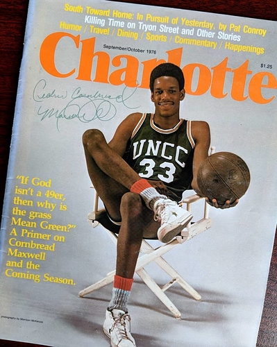
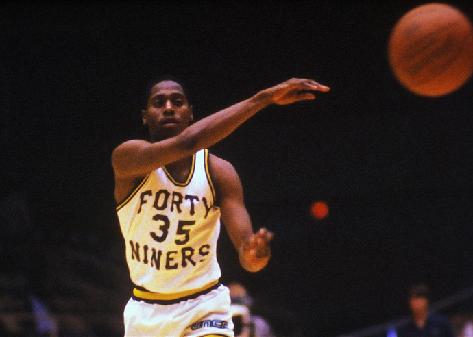
Looks like a knitted elf’s cap. Probably some historic colonial reference if we research it.
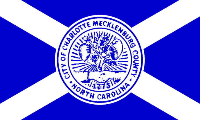
Looks like that imagery comes straight from the Charlotte flag.
“On the right, a liberty cap bearing the word LIBERTY hangs on one of the tree’s branches. The Liberty Cap is another reference to the Revolution, showing the desire of Charlotte’s citizens for freedom.”
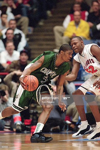
Someone has already posted this one, but here is Rodney in it. To me, it had a real edge in it’s design, sleeveless shirt style, and font. Fit right in in CUSA alongside Cincinnati’s who I believe had a very similar style.
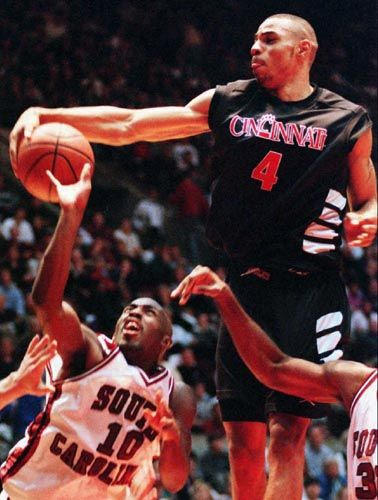
I liked the uniforms we had when we first put “Charlotte” on the chest and dropped the unc. I think it was 99. Bobby Lutz was responsible for that. He said he was tired of seeing our games on TV, one of our players would be shooting free throws and all you could see was the UNC across their chest.
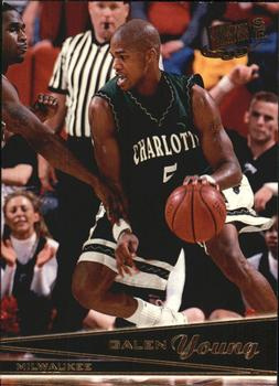
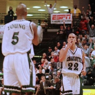
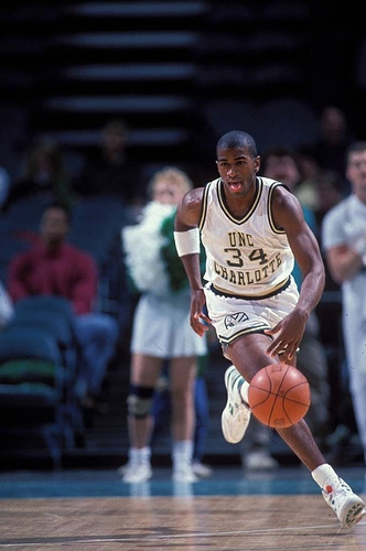
The shorts were pretty bad for this team. They had Niners down the leg in a different font and a tiny UNC Charlotte crown logo on the leg.
I think these are the best uniforms we ever had. Love the “niners” down the shorts and the unique pattern on the cuffs and the collar.
Closest thing we’ve ever really had to a uniform identity. Would love to bring it back.
We need a remake of this one for the upcoming season!
