Yeah Central America supply may not have been as drastically impacted.
As for supply and prices. The simplified logo should assist in retailers other that the bookstore having products that are more diverse and at lower price points.
Yeah Central America supply may not have been as drastically impacted.
As for supply and prices. The simplified logo should assist in retailers other that the bookstore having products that are more diverse and at lower price points.
From an article that article links to:
“1949 was also the year the school broke away from the University of North Carolina at Chapel Hill,”
Man, it sure was wrong of us to suddenly decide to have a pick in our logo design. Maybe we wouldn’t look so bad if we had it as part of our design for the last 50 or 60 years.
Gee, it looks like a pickax, as does Utep’s. Saying that we “copied” them is really, really stupid. I guess we copied in the same sense that the multitude of schools whose mascot is a tiger all copied one another. Implying that our 49er nickname has something to do with the gold rush of 1849 is beyond stupid and linking to our website that clearly states the reference is to 1949 (as evidence, I guess) is beyond stupider.
Love the comment about the state of N.C. becoming leftist, so we should have adopted the hammer and sickle.
Texass strong!
Technically you could say we broke away from UNC-CH in 1949 though in reality really the other way around since they decided to close their extension centers.
Nay, our last logo was the sickle.
UTEP can go to hell or the Mountain West, whichever is closer.
My guess is that there’s not a whole lot to talk about in West Texas.
at least they referred to us as university of charlotte
Well, UTEP and their “Battle of I-10” rival New Mexico State would both jump at a Mountain West invite, that’s for sure.
Anyway, not gonna lose any sleep over what our conference mate in far western Texas think about our logo.
Not a Hater to begin with, but this is growing on me. I wish I could have walked into the FB team meeting room 60 years ago! I believe I might have been pumped!
Does anyone else think it looks good in some places and not so good in others?
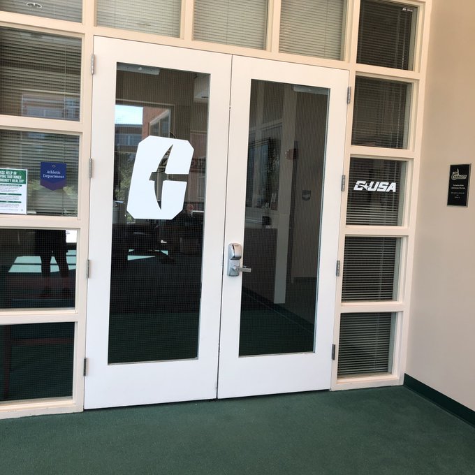
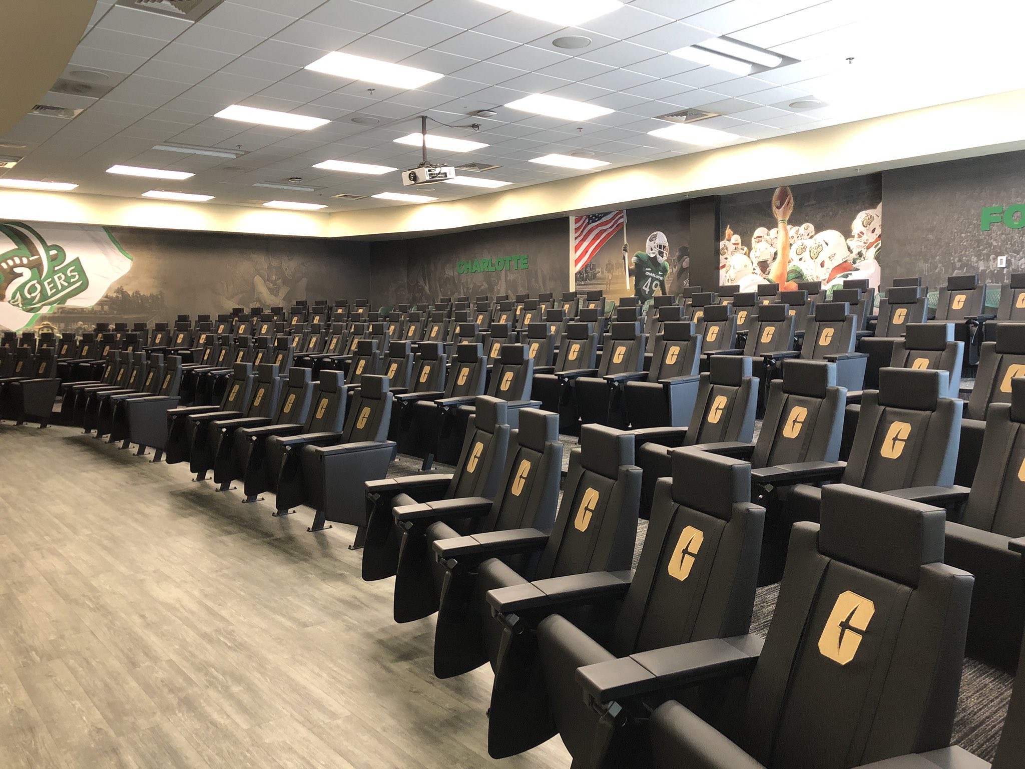
It certainly works better in certain places than others, which was the case with our previous logo (c-49er in particular) as well. I think it looks great on the glass and those seats. The simplicity lends itself to being used in ways that our previous logo couldn’t.
Agreed. I have seen in other places that they need to continue the rebrand through EVERYTHING. I hope they change the url from uncc.edu to clt.edu… thoughts?
Can’t take seriously a school whose dance team is the Gold Diggers.
UTEP acceptance rate 100%
UTEP graduation rate 38%
Lot of Texans must think of them as a safety school
It’s definitely growing on me but I get what you mean. I’d like to see what the C and CLT would look like without the nine degree tilt. I think the italics is what gets me sometimes. But overall, I like it and I’m sure I’ll grow to love it.
FWIW, our 4 year graduation rate of 28.7% isn’t exactly stellar. Of course, that increases to 49.3% / 5yr and 54% / 6yr, respectively.
Utep’s 38% was after 6 years. God knows what their 4 year rate is.