Scroll up and look at @AirForce49’s avatar. The circle it sits in rounds it off and gives it a different look. I like it.
I think the C looks better embroidered versus screen printed. The top and bottom of the C are parallel when embroidered so its a block C. Not so when screen printed. Also, the pick axe handle looks more uniform when embroidered. Doesn’t shrink from bottom to top as much.

Still has the 9 degree tilt in your image Mullins. Angle of it on the fabric makes it not as noticeable.
I think the pick axe & C are much more noticeable in everything I have seen since Tuesday. I really think the angle of the helmet from this past Saturday didn’t do the block C justice.
2 Likes
I have an automated daily 49ers google search that returned this…
https://kentuckysportsradio.com/nba-cats/today-on-ksr-tyler-herros-new-tattoos/
It’s Beautiful
I hope there’s more room on the Charlotte 49ers bandwagon because this new logo is spectacular, almost as incredible as head coach Will Healy’s celebration after the C-USA team earned its first bowl bid last fall.
3 Likes
I cant take any school that doesn’t field a baseball team seriously.
3 Likes
There are only so many ways to draw a pick-axe.
1 Like
Recent Miner Obsession interview with Fuller about the brand launch. Its long but I heard about some of the process behind the scenes. https://youtu.be/QFaGNk2lsg8
1 Like
Starts slow but is a good listen.
Not really into the green and gold hat but I like the rest. Maybe the hat looks better in real life.
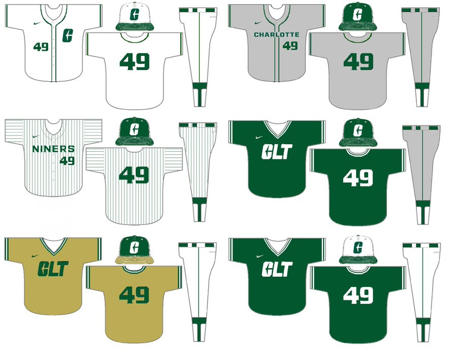
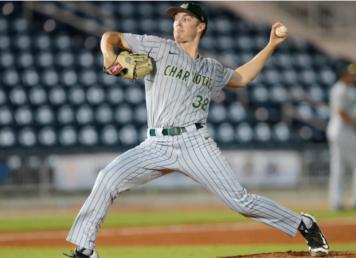
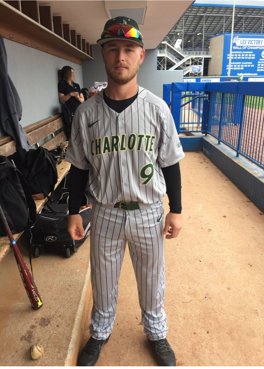
Anybody have a picture of the grey pinstripes from a few years back? I loved those
1 Like
How about if the logo was gold?
https://vintagebrand.com/l/college/t/fordham-rams/a/7838/p/1?sku=59
Speaking of copying and things that make you go “hmmm”
In related news, UTEP’s logo looks Similar to Utah State (minus the “State”), Tennesse’s, Elon’s and Princeton’s.
Ugh, I had no idea this was a C. Looks like a pick axe inside of Thor’s hammer.
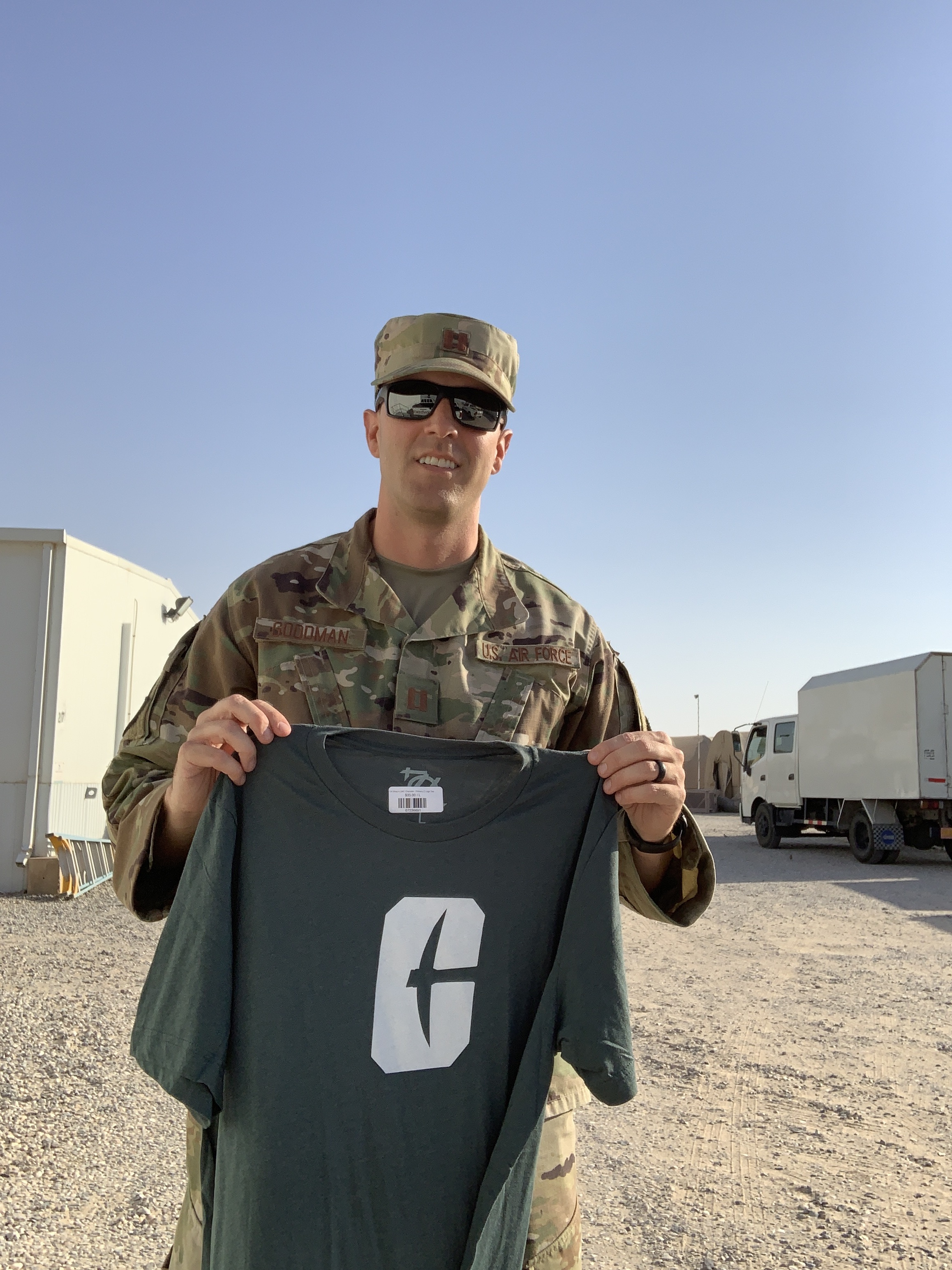
May God bless you sir, and thank you for protecting our freedom
4 Likes