https://twitter.com/rwoodard20/status/1281298135709634561?s=20
4 Likes
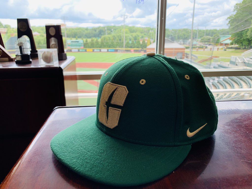
Hat is sharp. Logo is clean. I’m coming around.
The way it is embroidered it has a 3-D look around the edges. Still one color, but it gives it some depth. I would buy this.
2 Likes
It’s almost as if the good people of niner nation dot net dot com over reacted to something. Can you believe that?
4 Likes
NO I CANNOT!
I want one!
absolutely love this
Has anyone been able to find hats for the public to buy?
Sell this as a trucker cap with white mesh and I’d already have bought one.
Still waiting on mine to arrive here in Iraq!
8 Likes
Finally using GREEN instead of black!!!
https://twitter.com/Charlotte49ers/status/1283763323058585602?s=20
9 Likes
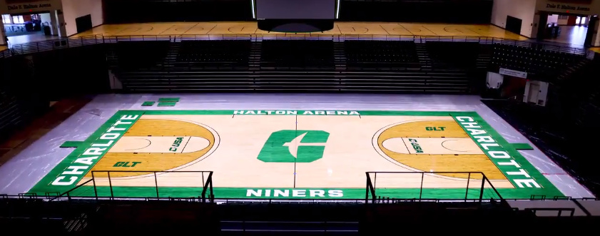
That’s sharp.
clt says haltron looks nice
1 Like
That leaves no doubt that our Green has changed.
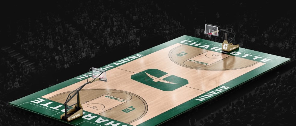
Can I make constructive suggestion about inside 3pt arc color? I like it more not so bright gold looking. Tone that down somehow. And go ahead and tone down everywhere else about 3 notches. Thanks. Other than that, looks good. I did like the black court but I like changing the court up to keep it fresh.
I didn’t hate the new logo when it was revealed, but I wasn’t thrilled. The more I’ve seen it around, there’s no doubt it’s a huge improvement however.
I agree @LzeroKI. The more I see it, the more it looks like a “C” without my brain trying to make it work.
People in shout box saying the green on the court is too close to Marshall green. If the picture is accurate, they have a valid point.
1 Like
Our Identity Standards Guide needs to be updated.