I found a drawing of the new front entrance. Looks good!
[URL=http://fmbld02.uncc.edu/news/Color%20Rendering%20Front%20Entrance%204-24-06.JPG]http://fmbld02.uncc.edu/news/Color%20Rendering%20Front%20Entrance%204-24-06.JPG[/URL]
I found a drawing of the new front entrance. Looks good!
[URL=http://fmbld02.uncc.edu/news/Color%20Rendering%20Front%20Entrance%204-24-06.JPG]http://fmbld02.uncc.edu/news/Color%20Rendering%20Front%20Entrance%204-24-06.JPG[/URL]
Wow, that look really great. A lot better than I thought it would.:toast:
looks good.
UNC Charlotte, damn.
Doesn’t look too bad. Kinda looks like they just boxed up the current sign and used it in the new one. I like arches though. It would have been interested to see a design that involved an arch. Overall though tons better than the current sign.
Remove the “unc” from the sign and we’re good to go! Looks too much like a branch school the way it is. I never have liked that logo!
I concur that it would look better without the “unc” part… but whatcha gonna do. What surprised me is that the crown logo isn’t anywhere (at least that I could tell)…
Other then that, I give it 2 thumbs up!
Who’s up for tearing it down immediately after it’s installed, or chiseling out the “UNC” part?
Starting to look very good.
Who's up for tearing it down immediately after it's installed, or chiseling out the "UNC" part?The "unc" part appears to be etched in the stone... Let's just fill it in with quick drying cement!
Who's up for tearing it down immediately after it's installed, or chiseling out the "UNC" part?
LOL I was thinking the exact same thing!
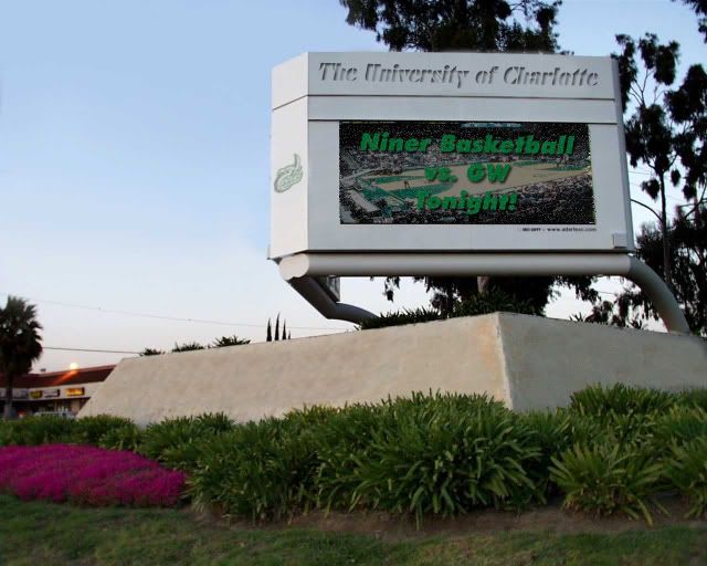
That looks really nice. Obviously a digital display wasn’t as big of a priority as most of us had hoped, but it still looks nice.
[QUOTE=CMack124;173114]That looks really nice. Obviously a digital display wasn’t as big of a priority as most of us had hoped, but it still looks nice.[/QUOTE]
There’s just something about a digital display on an entrance sign that screams “not classy” to me. i’m glad it doesn’t have one. shrug
There's just something about a digital display on an entrance sign that screams "not classy" to me. i'm glad it doesn't have one. *shrug*
yeah i’ll have to agree with you on this one anborn. I just think if we went that road it would look trashy and take people’s eyes off the road and eventually cause more wrecks.
There's just something about a digital display on an entrance sign that screams "not classy" to me. i'm glad it doesn't have one. *shrug*
needs more cowbell
that thang is ca razy
you know your stuck in the past when the artist drawls a station wagon in the picture!!
that looks killer but we really need to get rid of that unc. Y is it so hard to get this darn name change??
Oh, and the crown logo def should be on there. That crown logo is the shizznat.
[QUOTE=Forty-Niner;173099]The “unc” part appears to be etched in the stone… Let’s just fill it in with quick drying cement![/QUOTE]
Don’t really need to do all that. Just throw a burlap bag or something over the “UNC” part a couple of times and people will start getting the message.
There's just something about a digital display on an entrance sign that screams "not classy" to me. i'm glad it doesn't have one. *shrug*
I totally agree. Digital displays look too community college or even high school to me.
But, I love the idea about filling in the UNC part with quick-dry cement!!!
![]() :shades:
:shades:
![http://fmbld02.uncc.edu/news/Color%20Rendering%20Front%20Entrance%204-24-06.JPG[/URL]](http://fmbld02.uncc.edu/news/Color%20Rendering%20Front%20Entrance%204-24-06.JPG%5B/URL%5D)