https://x.com/i/status/2029183868427780369
https://x.com/i/status/2029186825537953825
![]()
I will say that this is one of the things I hate the most about Euro soccer and I wish we weren’t importing the practice to American sports. Giant corporate logos on sports jerseys are stupid looking. I’ll tolerate the jersey manufacturer logo if it is tasteful and not front and center, but this looks awful. This Tyson logo reminds me of this awful Chevy logo on the Man U kit which I also despise:
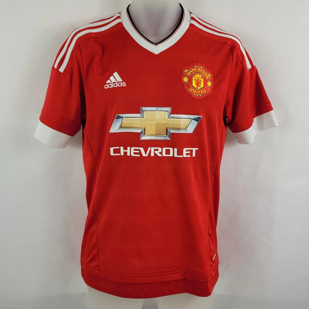
That looks stupid. The corporate logo, which has nothing to do with the sport, is bigger than the club crest.
That Tyson Foods logo is bigger than the SEC patch. It’s just going to get worse I suspect.
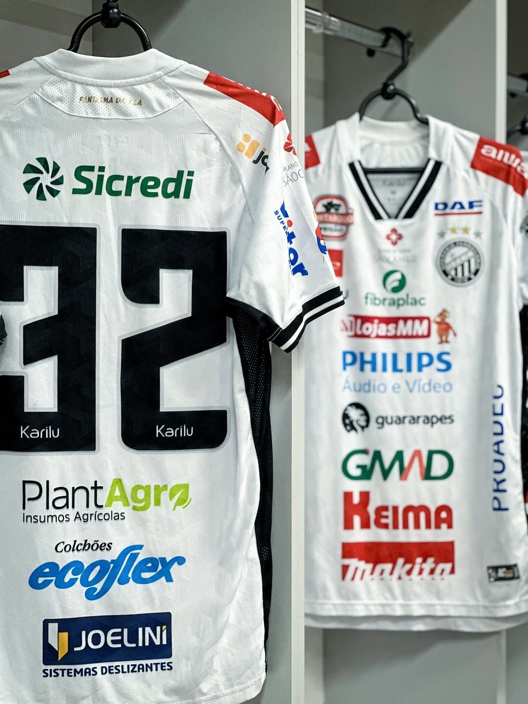
if you don’t like that you definitely shouldn’t look at the Liga MX kits.
So he was among the reported 40% of attendees not named Trump who got a chance to get in a word edgewise. ![]()
I wonder how this affects us trying to get back in with Learfield. It wouldn’t surprise me to see them start cutting schools instead of adding them with private equity running the show.
Private equity will gut the organization like a fish, including most of their coverage agreements. Count on it.
I hope we can get back in with them or another deal like that. I think going out on our own was a mistake, but I would be happy to be proven wrong. It’s crazy that an AAC program can’t get mbb games on local radio.
The lack of transparency about our MBB radio outlet is troublesome. I don’t recall any announcement that WFNZ had dropped us at the beginning of the calendar year nor do I recall anything said on air by Matt. Then we “reappeared” on 730 AM during the American tournament in Birmingham. Hopefully White is making this a priority for resolution.
We didn’t even have radio equipment to go on the air just before football season started last year. Mike didn’t realize that was all owned by Learfield and went out the door when he fired them. Just 1 of many mistakes Mike made while here. Not sure what he was thinking bringing that in-house.
Meet the new boss. Same as the old boss. ![]()
FWIW, Weatherford (aka “Mr. USF”) has been the chair of the USF Board of Trustees for the past 5 years. As in the entire university, not some role with the football team. Just announced that he is stepping down from that role but will remain as a BOT member.
https://x.com/i/status/2049597214377611584
Another story about the deal.
It’s unclear how many of the Big 12’s 16 universities plan to accept the option of up to $30 million in credit. Schools have one year to make a decision on the one-time capital infusion. Those within the conference believe that as few as two and as many as a half-dozen programs plan to take the money, which comes at a rate just south of 10%
Ummm, so this Capital deal is just a line of credit at an interest rate of nearly 10%? That sounds like a horrible deal.
