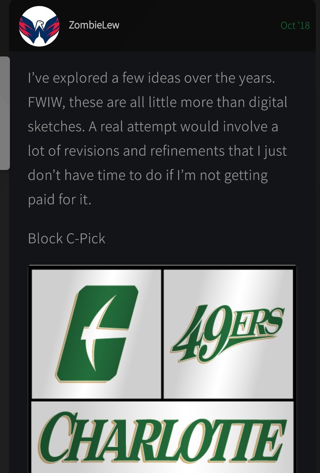
Very much approve. Less is more, IMO. I’m guessing the big block White C was to help showcase the pick axe inside. Like that we are using CLT as well. Looking forward to the rest. There’s an old school new school vibe to it.
 Hill.
Hill.
Very much approve. Less is more, IMO. I’m guessing the big block White C was to help showcase the pick axe inside. Like that we are using CLT as well. Looking forward to the rest. There’s an old school new school vibe to it.
Hill.
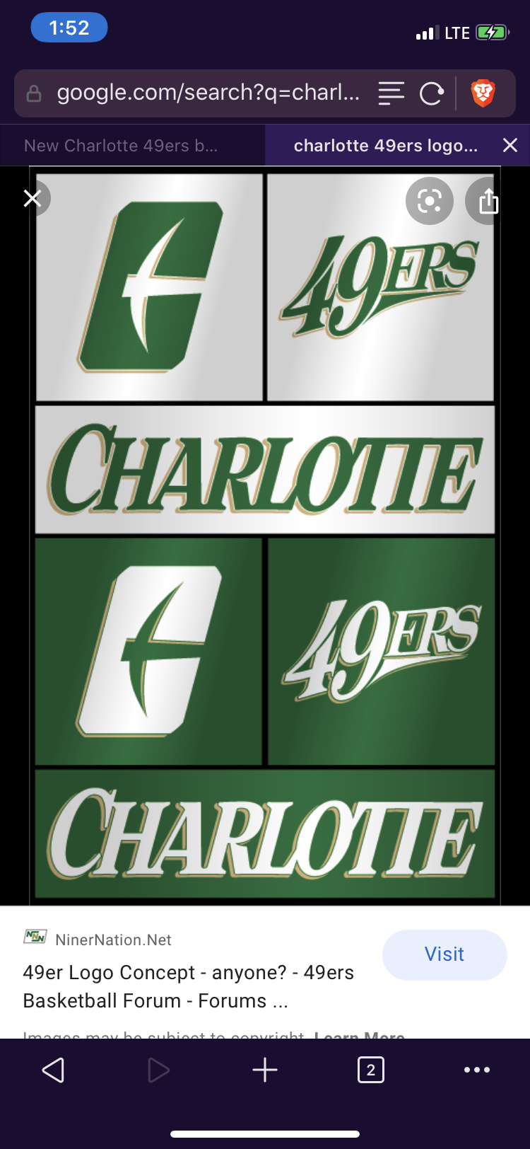
A big Block C that looks just as much like a big rectangle…a small pick that looks just as much like a bird or a plane.
It’s clean and simple but also not very #bold
I love the dark green and the CLT. Partnering with the city more is HUGE for future Conference dreams. I just pray to God the Gold reveal isn’t Yellow.
4/10
clt says 11k views already
Simple, new kind of C-pick. I REALLY liked the old plain C-pick, and still prefer it, but this is growing on me. The fact that I love the old C-pick so much and I don’t hate the new one is a good sign. Like a lot of you are saying, wish the edges were rounded more, but it works. Ask me again in 5 years.
I did not see the “C” until someone pointed it out. So far, not impressed with that specific one.
I hope we still have gold in our color scheme not just green and white. Would people like if the helmet had a gold facemask or maybe the logo be outlined in gold. Also people don’t forget our athletic master plan should be coming out this year as well. The green kind of reminds me when my Dad was at the school.
You are ahead of me. I don’t see a “C” even though its pointed out. Logo is meh, OK, though.

I assume we used the designer from Central Michigan??
i wasn’t a fan of it but now thinking about it, i think it will grow on me. don’t really understand how it appeals to 14 year olds but i guess they will tell us more on the 23rd.
A little disappointed. On the bright side, I will be able to buy some of the old Cpick apparel when it goes on sale. I was really hoping for an update of that.
I like it. I think it looks clean cut, professional. It’s exactly what we need to build our brand and get scooped up by the AAC.
That video was as strong as our rushing attack.
Like the new logo.
Not pleased. We had a chance to get it right.
Interesting…this board is filled with positive feedback. The Twitter feed is very negative.
Still…always proud to be a Niner. 
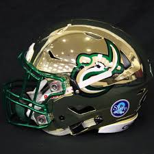
Just doesn’t compare to this…at all.
This is literally one of the best helmets in all of college football.
It may be a more simple and easier to market design…but it’s a BIG step back on our helmet.
i can’t disagree. that’s a great looking helmet.
I like it. It’s simple, new, refreshing and distinct. The way we are pivoting with the city and representing the city with “CLT” is great. We should be cohesive in promoting, marketing, branding with the city. The city should be all in with the relationship it has with ITS University.
Sounds like a good possible relationship with 704shop as many of their items are CLT related. It will also give us something different from the Charlotte Hornets with their CHA branding.
In Lew’s design the pick is pushed further back in the body of the “C”, and I think that gives it better balance.
I do wonder if he was involved in this project. If not, we may all get subpoenaed.