If we could pull off a university name change, I would be fine changing the mascot/nickname at the same time. I am a Niner through and through, but I could be a just as well.
I don’t think we are changing colors, just going with a shade of green that is easier to mass produce. Same with the shade of gold.
Name is not changing. Norm is not part of revamp but is on the to do list.
So the rebrand will not derail the University of Charlotte momentum?
No, that juggernaut will chug along for however long it takes.
2 Likes
Charlotte Raptors.
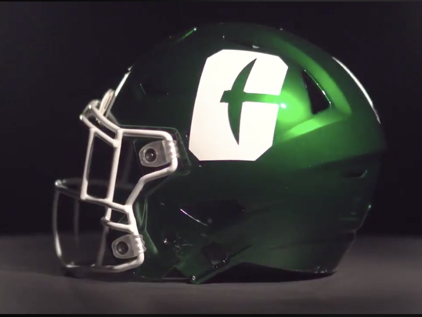
Loving the new video they just put out on social. Clean logo
1 Like
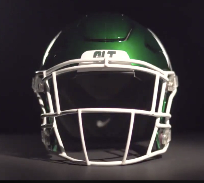
A lot of white
Yeah, the video was great. Gave me chills. I like the logo; very simple.
I’m cool with that. I would be interested in the other iterations.
I like the logo. Don’t like the white. Give me green C on a white helmet I think it would look better.
looks like the Charlotte Jets
If the rebranding was a part of the original 10 year plan that we’ve been delaying, I’m curious as to why the decision to release the logo was make for next week (with a leak pushing it to today)?
I think we will see better pictures and more versions on Tuesday
Agree on the video. Plus I’m in it twice, so even better.
Love the new logo.
1 Like
clt likes it, very clean
1 Like
From what I’ve heard they are starting to make the changes on campus and with athletes and others coming back now to campus they needed to get out front of it before it was leaked. Unveiling it now means they control the message hence the video.
My initial reaction was I don’t get the blob of white but then I realized it was a C. I agree with others that maybe they should have rounded the edges a little more. However, I will say that its growing on me.
I like it honestly, I’m excited to see what else they do with it
2 Likes
The video was great. But someone please convince me that this logo is the right direction for our branding. The attempt to for a clean & simple design is good, its what we need (much like removing the 49er out of the C Pick). But when I look at the C on this, at first glance, it just looks like a big white rectangle block.
I guess i was hoping for cleaner/simpler C Pick design… that seemed to be gaining traction and popularity. but this may grow on me…
1 Like