NNN's University Logo Design Effort

[QUOTE=CharSFNiners;339221]I’d center the “North Carolina at”. It’s not balanced enough[/QUOTE]

I disagree. If the type was not within the green line, I would say center it. But with it being in the line, especially with the seal beside it, it should be left justified.

I think if you were to see it centered, you would agree. The green line, along with the justified text, really draws the eye to the seal, which is where it should be.

Depending on the weather this weekend I might be able to mess with some illustrator and photoshop and see if I can come up with something to throw into the ring.

[QUOTE=thelew1014;339225]I think if you were to see it centered, you would agree. The green line, along with the justified text, really draws the eye to the seal, which is where it should be.[/QUOTE]

I agree with you too. :biggrin: I reserve the right to change my opinion at will.

I pay attention in class :slight_smile:

Exactly Lew. With it running along with the seal, and the top words aligned to the seal, it would be INCREDIBLY poor design to have the NC at centered.

[IMG]http://www.party49ers.com/photos/fullsize/274865.jpg[/IMG]
I like it, i just think it is way too complex for a logo. If you shrunk that down to go on letterhead or a business card it would be very busy and maybe unreadable.

Shrunk down on letterhead it still looks fine. I just printed it on a 300DPI monochrome laser at about .75" tall x 2.5" wide. Now I do see your point about the business card. But, if you think about it, most of the time when logos are designed, they have alternative versions for different purposes because not always does one design fit all. I won’t take the time to come up with said solution, but if I was doing actual logo design, I can promise you, those types of things would be taken into consideration.

Additionall, when printed small, the North Carolina at is still visible, but at first glance, it reads University of Charlotte… which is kinda the point.

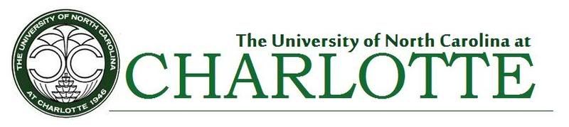
I tried to come up with a way to emphasize University of Charlotte while maintaining our official name… a branding package to keep all interested parties happy, while using some type of symbol that represents the school. I think the crown is ugly, and a lame idea anyway. Charlotte is the queen city, whoopdie do. The University’s logo should be something indicative of the school itself IMO. I chose the seal because it is one of the few constants at UNC Charlotte. The Belk Tower is too tall and Phallic. The clock tower at halton could be used, as could something else creative.

The way I see it, the PRIMARY Interests in designing a new logo for the school are as follows:

  1. Emphasize the Charlotte portion of the logo
  2. Maintain inclusion of North Carolina at (it has to be done for CHP)
  3. Clean colors and design
  4. Have an anchor logo that represents the university; not the system, not the city, UNC Charlotte

Another thought on my design briefly (not that its perfect): It would be very easy to slide the University of North Carolina at Charlotte Text into a center alignment, take the school seal, and make it a watermark behind the text, for things like business cards (non-embossed of course) and letterhead for flexibility.

Short of that, someone will have to create an idea, draw, and make in a vector based image, a completely unique symbol for the university, one that is clean, represents well, and is scalable across all media. It is a tough job to essentially create an ICON that represents the university, but if you want a COMPLETE redesign of the logo, that is the main thing that will be required. You can play with typefaces, alignments, etc., all you want, all day long, but until you find an icon to represent the school, and can still successfull incorporate either UNC or North Carolina at into it, its a long shot.

That was long winded all but for to say that I designed this the way I did for a reason. And if you don’t want the North Carolina at in the logo, then it HAS to be UNC Charlotte. There is no other way around it. Just some serious things to think about for those of you who wish to embark on this endeavor. Sorry if I sound preachy, but I do have some experience with these things.

Exactly Lew. With it running along with the seal, and the top words aligned to the seal, it would be INCREDIBLY poor design to have the NC at centered.

Sorry I actually did a school of design.

I also, just do not like either of the logos for our school. Not a shot at you central, you’re using the school’s logo, but both remind me of circa 1968.

Then you know about invisible lines and not having multiple alignments running through a design.

And also, I’m really not trying to parade my design as the best. I have a total of maybe 15 mins in this between doing the first run, then changing the type face to this one.

I’d LOVE to see yours though with a design background, because I have slim to no schooling in it, just some experience. I’d like to get my neighbor to do one too actually, he graduated from the Art Institute and he is awesome. I’ve got him working on something else right now that I think is a kickass idea.

I am not particularly in love with the school seal either, but that is one thing that will NEVER change, and its not too bad once you get used to it lol.

Then you know about invisible lines and not having multiple alignments running through a design.

Yea, and you have all left justified. You can have multiple lines of alignment, not just one. “The University of” and “Charlotte” while left justified still look centered about eachother due to their length. So to me, the only thing that looks left justified is the “North Carolina at”. It’s just my opinion… I think it should be centered, it was a comment, take it or leave it. You left it.

My contribution

Doobs contribution

Ha ha j/k. You know I love the Doob.

I lifted the old logo from a pdf for anyone that wants a vector file…

www.ltmelectronics.com/media/UNCCharlotte_Logo.eps

[QUOTE=Charlotte2002;339026]Thanks.

Also is there a specific font required, or do we have freedom with that?[/QUOTE]

I was messing around with it and the old logo looks to be in Trajan Pro or a slightly modified version of it. It is to my knowledge that USC (Southern California) Uses this font as well.

See example: http://www.ltmelectronics.com/media/UNCCharlotte_Logo.jpg

Ok this took 2 minutes in paint, but whatever.

I was messing around with it and the old logo looks to be in Trajan Pro or a slightly modified version of it. It is to my knowledge that USC (Southern California) Uses this font as well.

See example: http://www.ltmelectronics.com/media/UNCCharlotte_Logo.jpg

After seeing the 2 of them side by side, I can’t believe they made the C in Charlotte smaller. This is just the opposite of what it seems most alumni want for the school, to make Charlotte more prominent. This has helped me decide to definitely send an email.

Great thread. I’m working on one right now.

[QUOTE=gotLutz;339312]

[/QUOTE]

very well done.

[QUOTE=CharSFNiners;339221]I’d center the “North Carolina at”. It’s not balanced enough[/QUOTE]

I completely agree with you. It’s a great logo but it looks bizarre with the middle text left justified.

oh yea!:49ers:
(freakin sweet idea btw, James Bond)

Is there a reason mine will not upload? a jpeg at 160kb?