Check it out…
2 Likes
I may be in the minority but I like a lot of our current logos…sans the unc and the 49ers crammed in the c pick.
I absolutely HATE yellow replacing the gold. Green and yellow is horrid…I would much rather keep the Vegas gold.
And I like our actual old norm too…much better than this remade old norm.
Give me the c pick without the 49ers in it, a standard dark green and Vegas gold…and revive our old 80’s norm as a retro logo and I’m good.
Again…I’m sure I’m in the minority with that.
3 Likes
I agree with you Leader. That yellow green and piss yellow are non-starters for me. I hope that does not end up being part of our rebrand.
I don’t have a problem with improving on what we have but none of this in my opinion is an improvement.
NO YELLOW!!! Please.
I’m with TRLeader
Was just some guys having fun. I applaud the effort. More effort than Stamats put in - and we paid them!
The “c” looks like a bad minor league hat from the 80’s
Nothing about this is good. It says, we are the Richmond County Raiders. Is that who we want to be compared to?
I love it. Simple and clean. Tweak the colors some.
The University of Charlotte Mello Yellows. As opposed to the Mean Green
I’m sure I’ll be in the minority, but I actually like it a lot. I’ve always liked green and more of a yellow-gold. Like Oregon (when they aren’t using their neon highlighter version) or ndsu. Or old school Sonics, like in my avatar. I also really like the font and numbers. Those hoops jerseys are pretty cool. I know this was just for fun but damn those guys put in some work.
I like it a lot. We need simpler. It’s simpler. Uses the old and the new. Could do a bunch of crazy things with it. Which is good.
I LOVED the “throwback number font”
I really enjoyed seeing this well thought out presentation. I don’t normally get to see the behind the scenes branding efforts.
I like our current green better, but it sucks all the light out of a building, and doesn’t pop on TV. This green would.
Their C-pick is simpler, easier to “read”, and intrigued me. I would like to see if it could be refined a bit, maybe slant it forward some.
I don’t like the short, fat Norm. I want our mascot to look like he would kick your ass and then sleep with your sister. This isn’t it.
The typography looked good. I like the Niners script for the baseball jerseys, and I love the pinstripes.
Are you trying to say short fat guys can’t sleep with your sister and kick your ass?
I am not saying he can’t, I am saying he doesn’t look like he can.
1 Like
While browsing logos, I came across this monstrosity from the local high school here in west Seattle. I think they are called the Cocaine Fueled Roid Cats ![]()
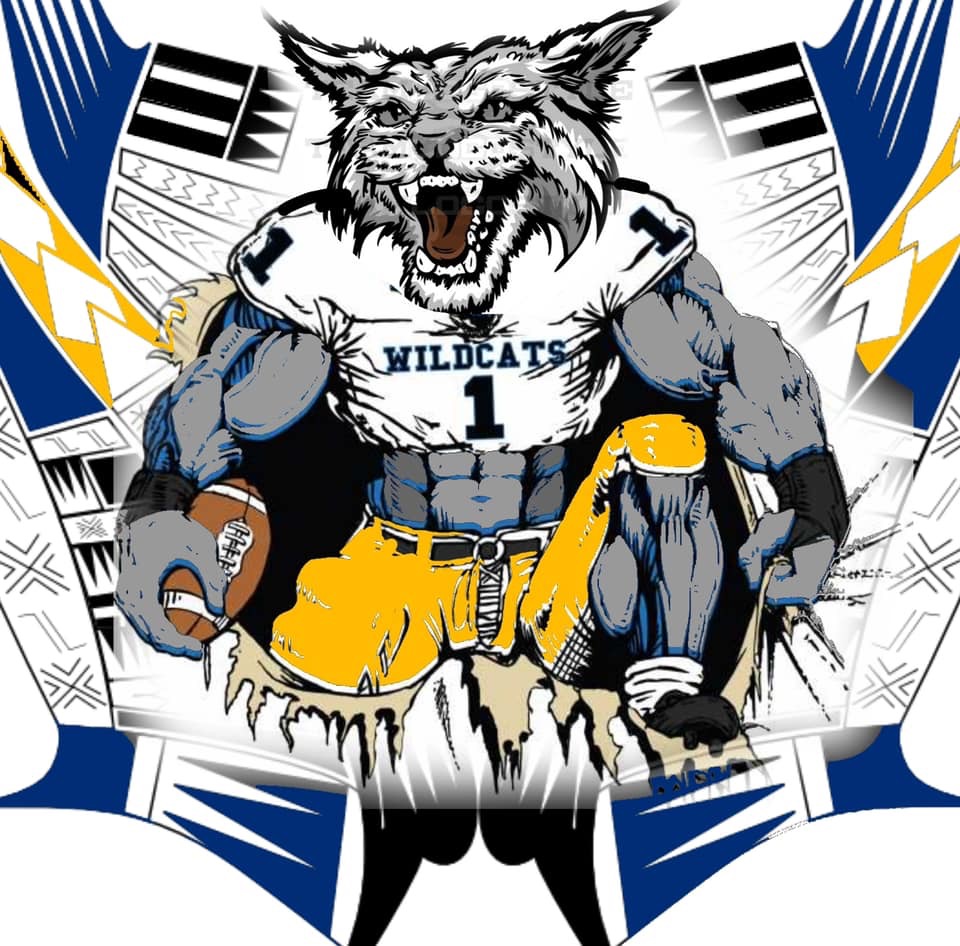

That logo kicks this logo’s ass
1 Like
Great effort! For me, this is how our rebranding should be approached. Recapturing some of the old, subtle references to where we are now as a fan base (chip in the letters like the chip on our shoulders, for example), and an attempt to stand out as a nod towards future growth.
A lot would need to sink in for me to know how I really feel about this specific design, but I immediately thought every jersey looked badass. If anything, this brand in print lacks the appeal the jerseys capture.
But again, great effort and I enjoyed reading about the ideas that drove design. Great design starts with well defined goals and you are spot on with all those.
I appreciate the effort put into creating this, but imo that logo looks god ugly. I really like the new norm though, and hope we move in that direction.