clt asks where is the “ we r Charlotte” option?
Please answer: What is wrong with the old-school, rugged looking Norm? It’s BY FAR the best version EVER! Why can’t we go back to that?
The yellow standard?? Hmm
I think the gold is a little too yellow, but i also really hate the current gold which is too tan/brown looking.
Appreciate the effort but just fucking shoot me. This NEW stuff is ugly as hell.
D.O.B.A.
And again…the piss Yellow is a Hell to the no
I like the Norm head and the font.
The yellow/green combo is too NDSU/Green Bay Packers for me. I agree with keeping the forest green and Vegas gold we currently have.
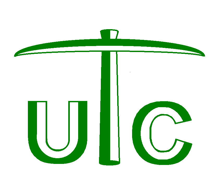
The C pick is horrid. The current C pick can be simplified but we can do better than 5th grade level art.
Bulk up full Norm and I like the 4th C pick in the top row of the hand sketches.
Overall, this work isn’t a bad place to start a redesign from.
Agreed, I think this is the best of the bunch in terms of C-picks they came up with.

Reminds me of twin cities/the twins logo.
Despite its flaws, these efforts are far superior to our current logo / font set. The beveled aspects of our set are damn near impossible to replicate and make look good on a helmet, hat, jersey etc… we need a 2d or 1 color logo like almost every other memorable brand in sports.
That and the lettering looks a little too familiar.
Ccc, that’s us right?
“City of Charlotte College, Please”
Simple, clean, efficient. Change the letter style and size as you want. It’s easy to understand and stands in the same realm as the twisted NC logo, the Texas Longhorn symbol or the Clemson Tiger Paw.
That’s how you MS Paint right their Edwards!
UTC? University of Tennessee at Chattanooga?
Pick axes aren’t letter “T” unless you force it.
This was my exact first thought as well…that pick axe image is tooooo much like a “T”.
If anyone has taken a look at the new Baylor unis, that is how yellow and green is done well. Other than that, I would really enjoy a real niner as opposed to the cartoon-esque version ie Florida State, ECU, Oklahama St.


