IKR, had the same thought.
Banners for ants
I saw those yesterday and thought they were a joke…guess I was wrong.
At least lower them to windshield height. 
clt says banners for kids that cannot read so good
Disagree with this. When we changed to black from the old green, it looked far better in imo. there is enough green in Halton. You can see the upper level seats perfectly with no one sitting in them.
the team should wear the black unis more often too
At those little tiny banners…

You know whomever installed those was scratching their heads thinking those in charge were idiots.
Everyone wears black uniforms. Welcome to Generic U.
I won’t derail this thread any more, we’ll just have to agree to disagree.
1 Like
uhhh, no
Not a big fan of black unis when it isn’t part of the school’s primary color scheme. Our shade of green is too good to give it up for a generic black look, even if it is one game a year.
1 Like
Agreed. If we need more of any color it’s GOLD.
2 Likes
I love the black unis, and hate when they wear all white. It just looks so plain and boring.
Would love to see gold ones.
1 Like
Uniforms are off-thread (pun intended?) from Campus Construction.
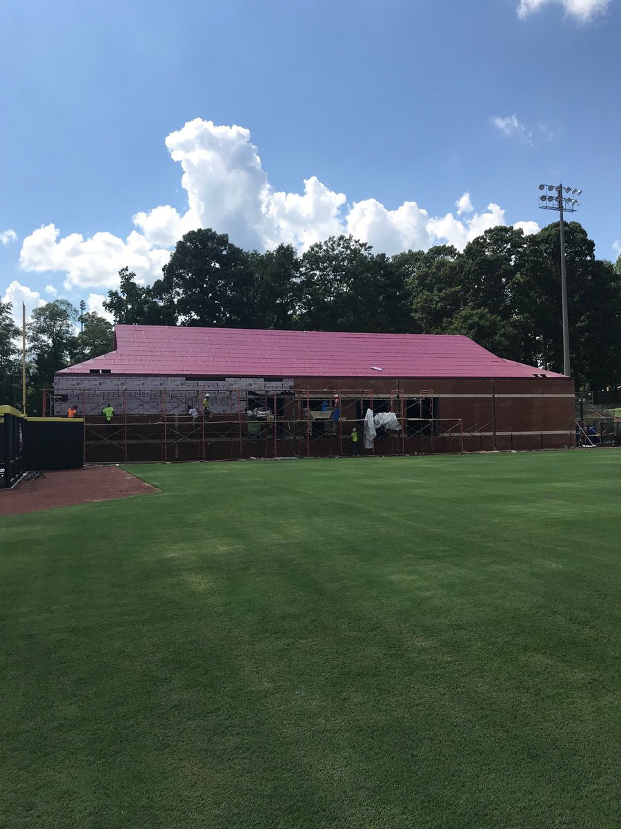
Some sort of rooftop deck would have been sweet here…
1 Like
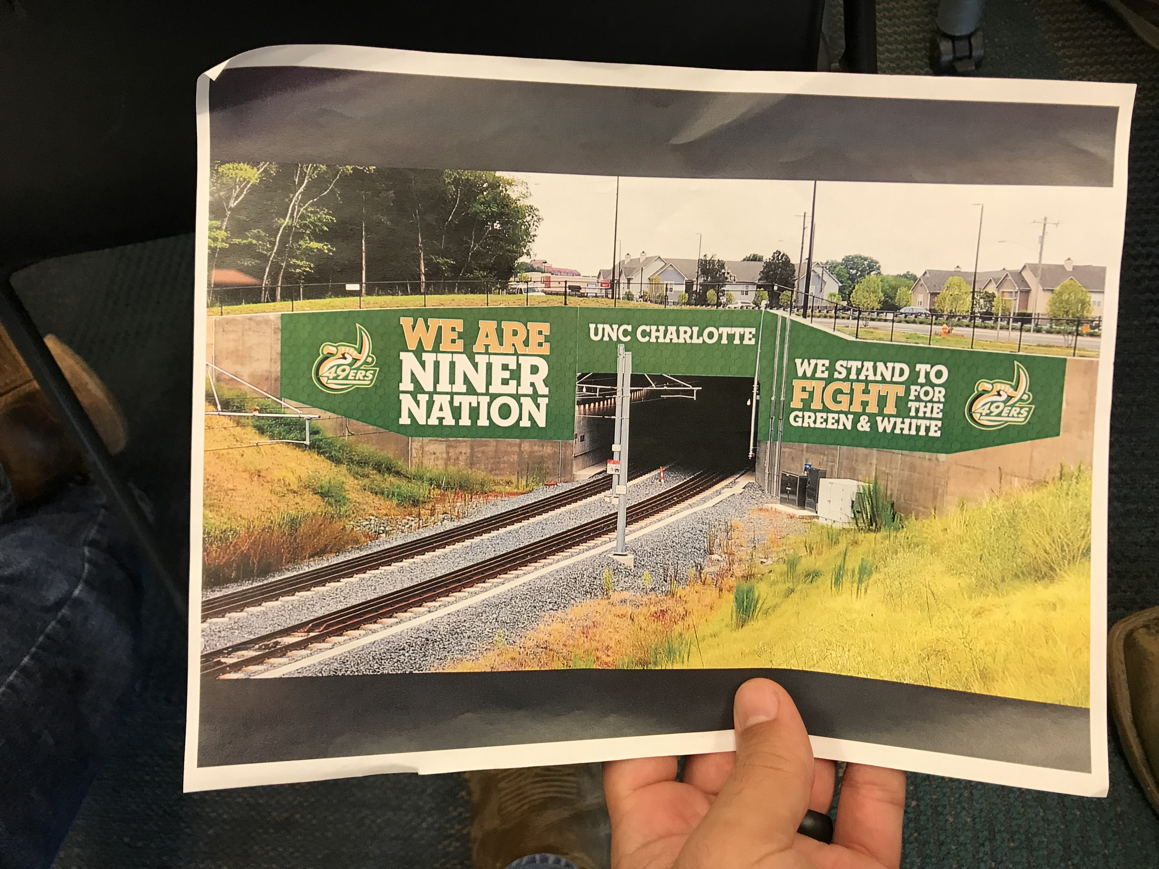
Nice. But…graffiti bait. Also, coulda just said “CHARLOTTE”
Elevators closed in Garinger and Barnard for the Garinger reno.
clt says athletic logo was to be only used with Charlotte.
Can you get anymore negative???
1 Like