State of Charlotte Flag

[quote=ā€œZombieLew, post:80, topic:27896ā€][quote=ā€œdmastinsc, post:78, topic:27896ā€]This is meant to be constructive…it’s been your efforts, not mine, but as an interested party:

If I were to have seen this flag at a tailgate this fall without the context provided in this thread, I would have asked myself, what the f*** does that mean?

It’s pulling several things from the city and school’s history together in one flag, but mostly things no one really knows anything about. It just seems there should be more of an effort to tie it to our school’s current branding. Just the words ā€œState of Charlotteā€, with the fonts matching our current fonts sells the concept immediately, in my mind at least.

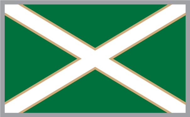
I guess in the end, the seal is what does it in for me. I totally get the green and white X and creating a flag to fly this message. I also see the green and white X becoming the only symbol necessary in the future. But, creating a ā€œsealā€ is a stretch and not something the thousands of fans at tailgates who will not have read this thread will have any clue of, and let’s be real, most won’t stop to ask, what the f*** does that mean?[/quote]

I’ll defer partially to NLP49 for this one…

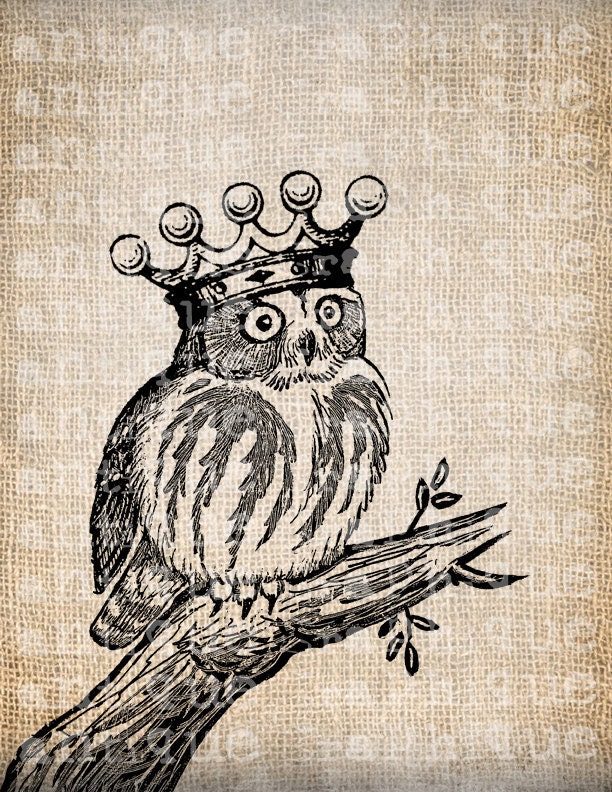
People may not know about these parts of our history, but that doesn’t make them any less meaningful. What I was working on before the old NC flag and the old owl logo were posted was a logo that consisted of our University’s crown logo in front of two crossed pickaxes. The final result tied in often overlooked portions of the history that got us to where we are today, whereas my crown and pickaxe idea does nothing to honor our past. In reality, it was creating something for the sake of creating something. There was no meaning behind it, it just was.

A few other things:

  1. This isn’t the only State of Charlotte reference you’ll see. Anybody who follows our coaching staff on twitter has seen it. I’ve said before, I think that ā€œState of Charlotteā€ really captures the sentiments of a very large portion of our fan base. We’re trying to stand on our own and push away the shadows that have been imposed on us. This gives us a rallying cry that comments on that.

  2. Using the school’s (really the AD’s) typeface… in this design, it just wouldn’t work. Our athletic department uses an oblique version of Gill Sans. Oblique text doesn’t work on a circle. It looks terrible. In the end, I’m still a designer. I’ll make some concessions here and some concessions there (like having to heavily simplify the owl) but putting italicized or oblique text on a circle? If I’m putting my name behind something, that’s one thing I won’t do.

  3. The seal itself - I don’t think you give our fans enough credit. We’re the opposite of Chapel Hill fans - almost all of us are educated and capable of extrapolating information from an image. Most of us know, or at least have heard at some point or another, that our original mascot was an owl. Almost all of us know the importance of the hornet’s nest to this area’s history. I’d be willing to venture that at least a few complete strangers would look at that flag and say ā€œHey, didn’t NC once have a flag that was something like that?ā€ They may have never heard or read the words ā€œState of Charlotteā€ before, but I’m pretty sure they’ll be able to figure out where we’re going with it.

That’s really what it is, to be honest. It is a combination of the original NC flag with the current city of Charlotte flag, with a nod to our school and its history. If we drop that seal, all we have is a Niner Green version of the Scottish Flag.[/quote]

I really like what you have done Lew.

You mentioned that your original design used the crown logo. What do you think about the owl wearing a crown to tie it all together?

looks nifty, but seals don’t belong on flags.

Indeed. Seals are rather heavy creatures, can’t fly a flag with a seal on it.

Indeed. Seals are rather heavy creatures, can’t fly a flag with a seal on it.[/quote]This actually made me laugh out loud.

More seals. http://thenugget.org/blog/2013/6/26/the-seals-of-charlotte

Whoa! Good find!

[quote=ā€œdmastinsc, post:78, topic:27896ā€]This is meant to be constructive…it’s been your efforts, not mine, but as an interested party:

If I were to have seen this flag at a tailgate this fall without the context provided in this thread, I would have asked myself, what the f*** does that mean?

It’s pulling several things from the city and school’s history together in one flag, but mostly things no one really knows anything about. It just seems there should be more of an effort to tie it to our school’s current branding. Just the words ā€œState of Charlotteā€, with the fonts matching our current fonts sells the concept immediately, in my mind at least.

I guess in the end, the seal is what does it in for me.[/quote]

I tend to agree. I think a random person is going to say ā€œthey aren’t the owls. they aren’t the hornets. i don’t get itā€. It seems you’re putting 3 unfamiliar ideas on the same flag, which could cause confusion. I.e. if you put UNC Charlotte with the hornets nest, or if you put put State of Charlotte with a C-pick, it would tie something familiar with something unfamiliar.

I too think the school seal would be a good option. We occasionally see it on tshirts. But I don’t recall seeing it on a flag. We mostly only see the C-pick on flags.

Having said all that, I’m not meaning to piss on the entire idea. I think it’s really cool you’re trying to do something different. Just wanted to offer on opinion on the type of feedback you might receive.

Indeed. Seals are rather heavy creatures, can’t fly a flag with a seal on it.[/quote]

What I am seeing and hearing is we all like the green and white version of st andrews cross, but with different logos or seals. I say we make the green and white cross the standard with various symbols or logos in the middle based on personal preference.

Lee, just let everyone get a high res version of the background and the company you use and let people order what they like.

[quote=ā€œNinerWupAss, post:89, topic:27896ā€]What I am seeing and hearing is we all like the green and white version of st andrews cross, but with different logos or seals. I say we make the green and white cross the standard with various symbols or logos in the middle based on personal preference.

Lee, just let everyone get a high res version of the background and the company you use and let people order what they like.[/quote]

But doing that would be admitting that there are more viable options than just mine and I am too stubborn and pretentious to accept that!

In all seriousness, though… above all I wanted this to be a unifying element… something that people could fly at their tailgates wherever they are. I know I’ve said it repeatedly, but I really believe that this #StateOfCharlotte thing has serious legs. I think it is something that we can all take up ourselves and rally around. I feel like twenty different folks with twenty different versions flying at twenty different tailgates doesn’t do that.

It seems like when you boil it all down, a Green and White Saint Andrew’s Cross is the only thing that seems to have been almost universally accepted. Every other element in the design was liked by some but disliked by others. If that common denominator is just a simple St. Andrew’s Cross in green and white… then I’m 100% behind it. (I’d add some gold trim though) There are a few pluses to that, anyway - primarily that a flag will be printed in such a way that the back is a mirror of the front, and a St. Andrew’s Cross doesn’t change. Also, J-Felt gets his dream of a flag without large marine mammals.

To me, though, the single most important thing about this entire project is that the end result is something that we’re all behind, not just some of us.

[quote=ā€œZombieLew, post:90, topic:27896ā€][quote=ā€œNinerWupAss, post:89, topic:27896ā€]What I am seeing and hearing is we all like the green and white version of st andrews cross, but with different logos or seals. I say we make the green and white cross the standard with various symbols or logos in the middle based on personal preference.

Lee, just let everyone get a high res version of the background and the company you use and let people order what they like.[/quote]

But doing that would be admitting that there are more viable options than just mine and I am too stubborn and pretentious to accept that!

In all seriousness, though… above all I wanted this to be a unifying element… something that people could fly at their tailgates wherever they are. I know I’ve said it repeatedly, but I really believe that this #StateOfCharlotte thing has serious legs. I think it is something that we can all take up ourselves and rally around. I feel like twenty different folks with twenty different versions flying at twenty different tailgates doesn’t do that.

It seems like when you boil it all down, a Green and White Saint Andrew’s Cross is the only thing that seems to have been almost universally accepted. Every other element in the design was liked by some but disliked by others. If that common denominator is just a simple St. Andrew’s Cross in green and white… then I’m 100% behind it. (I’d add some gold trim though) There are a few pluses to that, anyway - primarily that a flag will be printed in such a way that the back is a mirror of the front, and a St. Andrew’s Cross doesn’t change. Also, J-Felt gets his dream of a flag without large marine mammals.

To me, though, the single most important thing about this entire project is that the end result is something that we’re all behind, not just some of us.[/quote]

I really can get behind a green white st andrews cross and make that THE flag of niner nation. One thought though is that variation a country flag for anyone?

Oh and sorry I tried to type lew on my ph. Auto correct made if lee.

Indeed. Seals are rather heavy creatures, can’t fly a flag with a seal on it.[/quote]

http://thenugget.org/blog/2013/6/26/the-seals-of-charlotte

Just a green and white saltire with gold trim.

Without the gold

Like them both, gold seems more unique imo

My scotch heritage is loving this.

Shut up and drink your scotch.

[quote=ā€œZombieLew, post:93, topic:27896ā€]Just a green and white saltire with gold trim.

Without the gold

[/quote]

Definitely WITH the gold.

The seal is nice original work Lew. Great stuff man! I prefer the ā€œEst. 1946ā€ and I agree that making the branch turn into a pickaxe would be one too many elements in the space provided.

As for the ā€œState of Charlotteā€ business, I tend to agree with the ones who say that it is confusing. I like that the football team has started their own hashtag and made it popular (remember #The9?) but I think hashtags come and go. Soon the ACTUAL marketing campaign slogans will be introduced and #StateOfCharlotte will just become a long lost memory. Not to mention that it’s a little confusing (ā€œstateā€ as in state of mind [how I understand it and prefer to think of it] or ā€œstateā€ as in the region).

I think just ā€œNINER NATIONā€ across the top would definitely get the point across. As far as copyright infringement, if you just make one for yourself it shouldn’t matter. If you start selling them to others on the other hand, then yeah you’ll have a problem and you’ll need to pay UNC Charlotte since I’m sure that’s trademarked.

Or you could even write ā€œThe Goldmineā€ across the top since the University has announced that that will be the ā€œofficialā€ name of the student section for football correct?

One thing you have to remember: Text will only look right on one side, the other side of the flag will look like a mirrored image.

I’ve started to send in for quotes, using the saltire with the gold trim. Once I start to get a good idea as to how much it will cost, I’ll pass that info on.

[quote=ā€œZombieLew, post:99, topic:27896ā€]One thing you have to remember: Text will only look right on one side, the other side of the flag will look like a mirrored image.

I’ve started to send in for quotes, using the saltire with the gold trim. Once I start to get a good idea as to how much it will cost, I’ll pass that info on.[/quote]

Can’t you just flip it horizontally to resolve that problem?